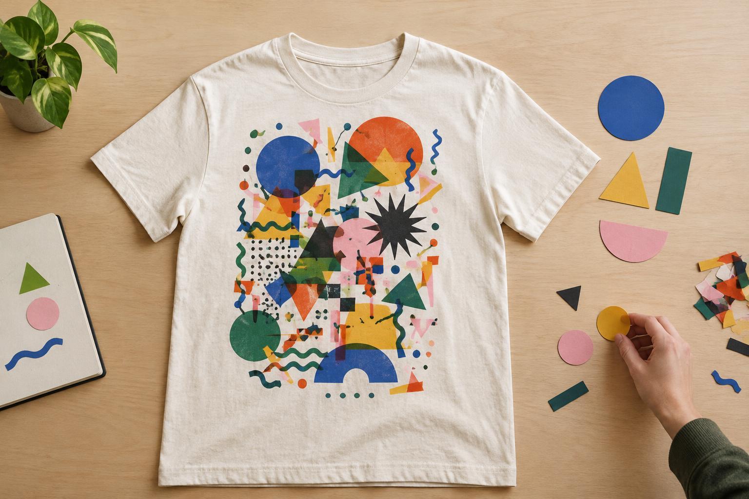
Trying to make every element the focal point
A graphic often becomes cluttered when its slogan, illustration, logo, border, and decorative shapes all demand equal attention. If everything is bold, nothing leads the eye. Before arranging the design, decide what someone should notice first. It might be a short phrase, a character, or a simple symbol. Supporting elements should reinforce that choice rather than compete with it.
A useful test is to view the artwork at thumbnail size. Can you identify its main idea quickly? If not, reduce the number of prominent elements or change their relative size. A small line of supporting text does not need the same weight as the headline. Likewise, a background shape can frame an illustration without becoming a second centerpiece. Removing one element may give the remaining ones more impact.
Filling the entire print area
Unused space is not wasted space. A little room around text and imagery helps a graphic read as one deliberate composition. Crowding elements against each other—or against the edges of the artwork—can make even a simple design feel cramped. Borders are a common culprit: they may seem to tie a design together while leaving too little breathing room inside.
Check the design on a T-shirt mockup, not only on an empty canvas. A graphic that looks balanced as a standalone rectangle may feel too wide, too low, or too close to a collar when placed on a garment. Try a smaller version and compare it with the original. Pay attention to how the artwork sits on the shirt and how much plain fabric surrounds it. Those choices can matter as much as the artwork itself.
Using too many type styles or too much text
A shirt is rarely read like a page. Long messages, multiple slogans, and several decorative fonts ask the viewer to work through a lot at once. Keeping the wording concise usually makes the idea easier to grasp. If every word seems essential, identify the core message and consider whether the rest belongs in a smaller supporting line—or whether it can be cut altogether.
Typography also needs a clear hierarchy. One distinctive type style paired with a simpler companion is often easier to manage than several expressive styles. Watch for narrow gaps between letters, cramped curved text, and words broken into awkward lines. Read the design from a few steps away on a mockup. If a phrase is hard to decipher there, adding outlines, shadows, or flourishes is unlikely to solve the underlying problem.
Adding detail and color without a purpose
Tiny lines, textures, badges, sparkles, and extra colors can add personality, but each should do a job. Detail that looks appealing when zoomed in may be difficult to notice at normal viewing size. It can also compete with the main image. Rather than decorating every open area, choose a few details that support the mood or meaning of the design.
Color works best when it helps organize what the viewer sees. Too many similarly prominent colors can scatter attention across the graphic. Start with the shirt color and a limited set of colors for the artwork, then check whether the focal point stands out clearly. Contrast matters for legibility, especially with small type or fine shapes. Because decoration methods and garments vary, treat an on-screen preview as a planning aid rather than a guarantee of how the finished shirt will appear.
Skipping the final edit
The last pass is an opportunity to simplify, not to fill every gap. View the design at several sizes, place it on a shirt mockup, and look away briefly before returning to it. Ask what catches your eye first, whether the message is readable, and which element you would miss least if it disappeared. If the answer is “nothing,” try hiding one decoration or reducing a secondary line of text anyway. Comparing versions is often more revealing than adjusting a single version indefinitely.
Before preparing artwork for decoration, check for spelling errors, uneven spacing, and details that depend on being seen up close. If you plan to use a print or decoration service, ask for its artwork requirements rather than assuming one file will suit every method. A successful edit does not have to make the design plain. It gives the most memorable parts enough space to be noticed.


