Decide what the name should do
A name is often treated as the entire design: set it in large type, center it on the chest, and stop there. That works when the wearer wants a bold introduction. For an everyday T-shirt, though, the name can play a quieter role. It might be a small detail near the hem, part of an illustration, or a label beneath a symbol the wearer likes. Start by asking whether the shirt should announce the name across a room or reward someone who looks closer.
Use the form of the name the wearer actually prefers. A full first name, nickname or family name can each create a different mood, and spelling matters more than a clever layout. If the shirt is a gift, check that the wearer is comfortable displaying that name in public. Someone may enjoy a nickname among friends but prefer not to wear it to the grocery store.
Give the lettering a personality
Lettering can make a name feel playful, understated or expressive without adding a complicated picture. Rounded letters may suit a friendly, casual design; narrow, simple letters can feel quieter. Rather than choosing a style because it looks impressive on its own, test it with the actual name. Long names need more room, while short names can look lost if the letters are spaced too far apart.
Capitalization and spacing also change the effect. All capitals can give a short name a strong silhouette, while lowercase letters may feel more relaxed. If you use decorative lettering, keep enough separation between letters to make the name readable at a glance. A quick test is to view the design at a small size on a screen: if you have to stop and decode it, the lettering may need simplifying.
Consider pairing the name with one modest visual element rather than a collection of icons. A tiny star, a simple border or a shape that echoes the wearer’s style can make the design feel intentional. Leave some empty space around both elements so the name remains the focus.
Choose a placement that suits the wearer
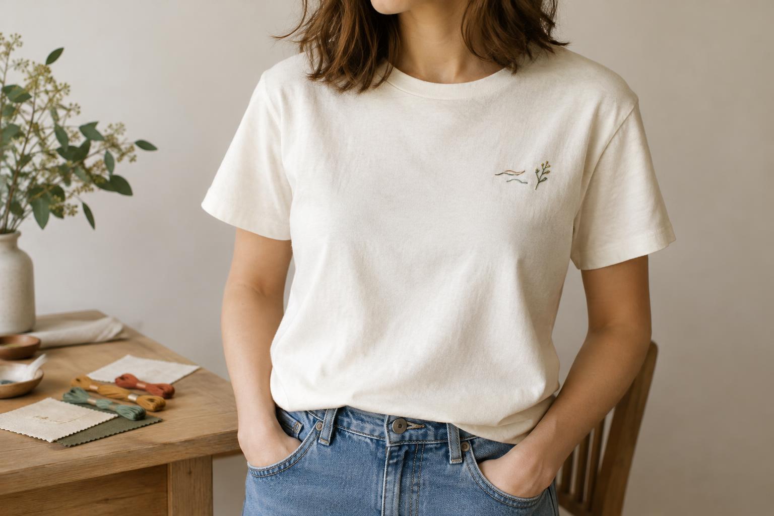
A large name across the front recalls team jerseys and event shirts. That may be exactly right for a group, but it is not the only option. A small name on the upper chest can feel like a personal signature. Placement high on the back adds an unexpected detail, while a design near the lower front can be less conspicuous. Sleeve and hem placements can work for very short text, although small details may be harder to read.
Think about how the person wears T-shirts. A name close to the hem may disappear under a tucked shirt or jacket. A design at the center front will remain visible but can feel more prominent than it did in a flat preview. If you are making several shirts, keeping the same placement and lettering style while changing the names gives the group a connection without making every shirt identical.
Privacy can guide placement too. A name that is legible from a distance may invite attention the wearer does not want. When in doubt, make it smaller or less prominent, especially for a shirt intended for frequent public wear.
Preview the whole shirt, not just the name
Before finalizing the design, place the name at its intended size on an outline of the full shirt. Check how much space surrounds it and whether it competes with seams, a pocket or another graphic. Test the design on the garment color you plan to use: a color pairing that looks clear on a white background may feel subdued on a darker shirt.
If you are choosing between versions, make a few simple previews rather than polishing one design immediately. Try a bold front name, a smaller chest version and an option that pairs the name with a single graphic. Viewing them at roughly the same scale makes it easier to judge which one the wearer might reach for on an ordinary day.
The best choice is not necessarily the most elaborate. A correctly spelled name, comfortable placement and lettering that fits the person can do more to make the shirt feel personal than an oversized design.


