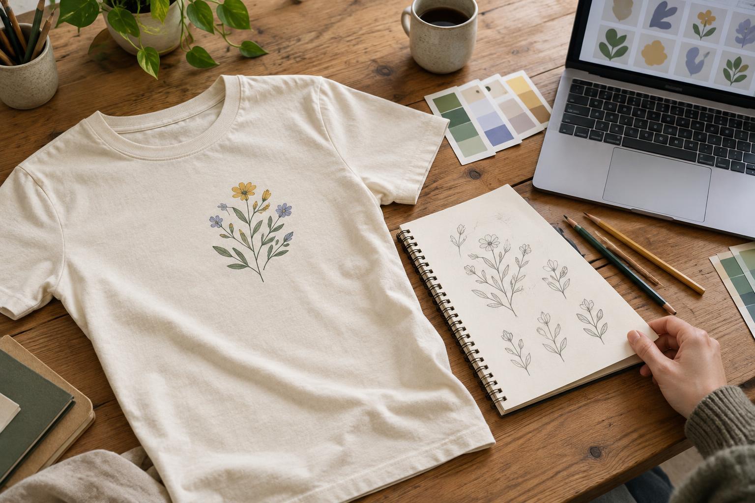
Why alignment matters in a multicolor print
A multicolor design may look seamless on a screen, where every shape sits in a fixed position. Printing adds a physical step: colors or layers must land in the intended places on a garment that can stretch, shift or vary slightly from shirt to shirt. When two printed shapes are meant to meet exactly, even a small movement can reveal a sliver of the shirt beneath them or cause one color to cross into the other.
Printers often call the alignment of these layers registration. Its importance depends on the artwork and decoration method. A design with separated color blocks may tolerate slight movement, while a fine outline around every letter makes any shift obvious. Planning for that difference at the design stage is usually easier than trying to correct a fragile layout during production.
Give colors room to move
The simplest approach is to leave a deliberate gap between colors. If a yellow sun sits above blue waves, a narrow band of shirt fabric between them can look intentional. A small alignment difference is then less likely to make the design appear broken. This works particularly well with bold, illustrated styles, though the gap should be wide enough to read as a design choice rather than an accidental crack.
Where colors must touch, a small overlap can hide the shirt fabric if one layer shifts. In print preparation, this adjustment is often called trapping. The amount and direction of overlap depend on the process, inks and artwork, so it is worth discussing with the person preparing the print files. Too much overlap may create a darker edge, a thicker deposit or a visible change in color.
Another option is to put one color inside a larger shape instead of matching two edges precisely. For example, a small red star placed well within a cream circle has more tolerance than a red star whose points are meant to meet the circle’s edge. This does not eliminate the need for careful printing, but it makes minor variation less noticeable.
Watch outlines, tiny details and text
Thin contrasting outlines are useful for definition but unforgiving when they surround a second printed color. If the inner shape moves, the outline can become thick on one side and thin on the other. Consider a wider outline, a simpler silhouette or a single-color version of the smallest elements. A bold contour that is meant to vary can also look more natural than a mechanically even border that fails to stay even.
Pay particular attention to small lettering. A second color used as a fine shadow or highlight may become hard to read if it does not align closely. Keeping essential words in one color is often the safer choice. Reserve layered effects for larger letters, where the offset can be deliberate and visible. The same principle applies to tiny eyes, narrow stripes and fine gaps inside an illustration.
Review the design at roughly the size it will appear on the shirt, not only at an enlarged zoom level. Check both a light and a dark garment mock-up if the design may be printed on different colors. The garment itself can become an unwanted line wherever adjacent printed colors separate.
Prepare a file that communicates your intent
If the design uses separately applied colors, keep the artwork organized so each color and its intended edges are clear. Name colors consistently, remove hidden shapes that are not meant to print, and distinguish intentional gaps from places where colors should overlap. A simple reference image showing the desired finished appearance can help someone reviewing the production file understand those choices.
Before approving a run, ask which parts of the design are most sensitive to alignment and whether the proposed method suits them. A full-color transfer, for example, may handle relationships between colors differently from a design built from separate screen-printed layers, although its outer placement on the shirt still matters. If a test print or sample is available, inspect the smallest text and the places where colors meet, rather than judging only the design from a distance.
The goal is not to remove every trace of variation. It is to decide where variation will be acceptable. Clear gaps, considered overlaps and readable details give a multicolor T-shirt design a better chance of looking intentional across the garments in a batch.