Start with the effect you want
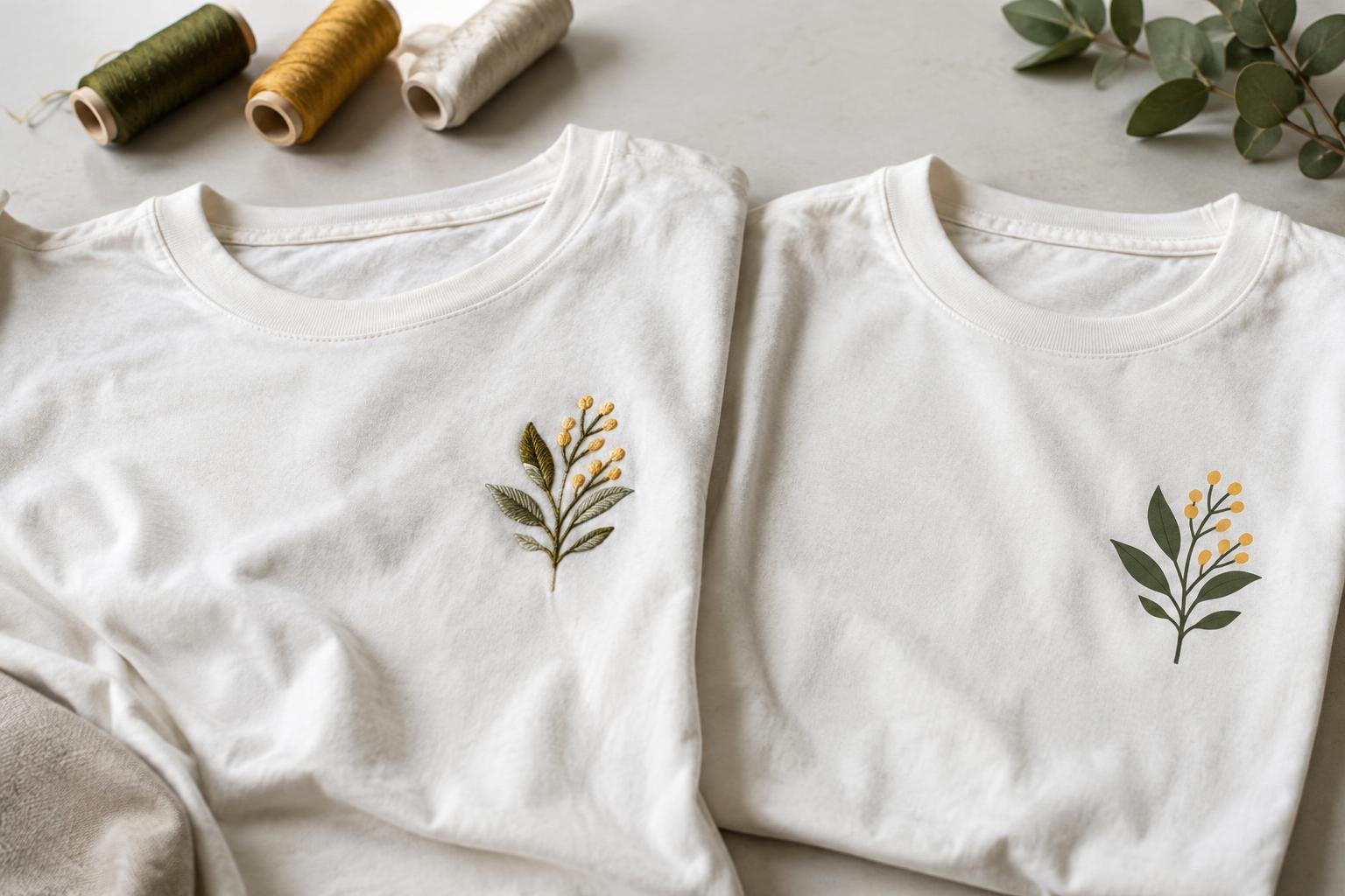
Embroidery builds a design from stitches, adding visible texture and a slight raised feel. Printing places an image on or into the fabric, usually creating a flatter result. Neither is automatically the better choice: a small emblem may benefit from the structure of thread, while a broad illustration may be more comfortable and easier to read as a print.
It also helps to distinguish among printing methods. Screen printing applies ink through a stencil and works particularly well with designs built from clearly separated areas of color. Direct-to-garment printing can suit artwork with many colors or gradual changes in tone. Heat-applied transfers offer another route, though their feel depends on the material and how much of the shirt they cover. The artwork, shirt and production method all affect the finished appearance.
Compare texture and comfort
Stitches catch light differently from printed color, giving embroidery a dimensional appearance even when the design is simple. A compact embroidered mark can make a T-shirt feel more like a uniform or a classic casual garment. On lightweight knits, however, a dense stitched area may feel stiff or pull at the fabric. Embroidery often uses a stabilizing layer behind the design, which can be noticeable against the skin.
A print generally adds less bulk, but it is not always soft. A large area of ink or transfer material may change how the fabric bends and breathes. Smaller shapes, open spaces within the artwork and placement away from areas that fold heavily can help preserve a comfortable feel. If softness is a priority, ask to feel a sample made with the intended method rather than judging from an image alone.
Match the method to the level of detail
Embroidery is strongest when the design has bold shapes, readable lettering and enough space between elements for stitches to remain distinct. Very small text, hairline outlines and subtle shading may become difficult to interpret when translated into thread. Simplifying a logo or widening narrow gaps can make a substantial difference. The artwork also needs to be converted into stitch instructions; a file that looks crisp on a screen is not necessarily ready to sew.
Printing gives more flexibility for fine lines, illustrations and complex color relationships, although every process has limits. Fine details may disappear if they are too small for the chosen print method or become less legible as the fabric stretches and moves. View the design at its intended size before committing. If a phrase cannot be read easily at that size on a screen or paper mock-up, changing decoration methods alone may not solve the problem.
Plan placement around the garment
A small embroidered design often works well on the left chest, near a sleeve hem or at the upper back. These areas give a compact motif room to stand out without creating a large, heavy stitched panel. Avoid placing dense embroidery across seams, ribbing or spots that stretch significantly when the shirt is worn. A thin T-shirt may also need a lighter, less densely stitched design than a heavier one.
Printing offers more freedom for large front or back graphics, but the printable area still depends on the garment and equipment. Consider where the design will sit on different sizes, not just on one flat sample. A graphic positioned too low can be obscured when the shirt is tucked in; one placed close to an underarm or side seam may distort when worn. For either method, check a placement mock-up on the actual shirt style and across the planned size range.
Make a practical choice before ordering
Begin with three questions: How large is the design? How much detail must remain visible? How should the decorated area feel against the body? A small, simple symbol points toward embroidery if tactile texture is part of the appeal. A large image, a gradient or a design with intricate lettering generally points toward printing. For a mixed design, a printed main graphic and a separate small embroidered accent can work, provided they do not compete visually.
Fabric choice deserves equal attention. Lightweight, stretchy or loosely knit shirts can be more sensitive to dense stitching, while the surface and color of a shirt may influence how a print appears. If consistency matters, request a sample or proof using the intended garment, design size and decoration method. Ask what changes are needed to make the artwork suitable for production, and check both appearance and comfort before approving it.
Once decorated, follow the garment and decoration care instructions. Turning a T-shirt inside out for washing and avoiding unnecessary heat are sensible general precautions, but care needs vary by fabric and method. Choosing between embroidery and printing is ultimately about matching the design to the garment and the experience you want when wearing it.


