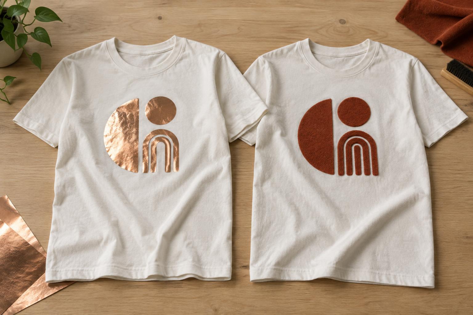
What makes foil and flock different?
Foil decoration gives a design a reflective, metallic-looking surface. Flock creates a raised, velvety texture instead. Both can be applied using heat-transfer processes, although the materials and production steps vary. Neither is simply a different color of ordinary printed ink: each changes how the finished design catches light or feels to the touch.
The simplest way to choose is to decide what should attract attention first. Foil emphasizes shine and contrast, especially when light moves across the garment. Flock emphasizes depth and touch, with a softer-looking finish that usually reflects less light. A small sample viewed and handled in person can tell you more than a digital mockup about either effect.
Where each finish works best
Foil can suit bold lettering, simple symbols and accents intended to look bright or celebratory. It works well when the reflective area has room to be noticed. A large block of foil, however, may feel less flexible than an undecorated part of the shirt. Its appearance can also shift with lighting and viewing angle, so a mockup showing a flat, uniform color may not represent the finished effect.
Flock suits designs where a tactile surface is part of the idea: varsity-style initials, substantial lettering, simple shapes or a small emblem. Its raised fibers can give a graphic a plush appearance without relying on shine. That texture may be less effective for tiny lettering or closely spaced details, where edges and gaps need to remain clear.
For either material, keep the design readable at its intended size. Thin lines, small counters inside letters and intricate patterns may be harder to produce cleanly than broad, separated shapes. Capabilities depend on the specific material and application method, so check minimum detail sizes with whoever will make the garment before finalizing artwork.
How fabric and placement affect the result
The garment beneath a decoration matters. A smooth, stable fabric generally provides a more predictable surface than one with pronounced ribs or uneven texture. Stretch also deserves attention: a rigid-looking graphic placed across an area that expands often may experience more strain during wear. Material compatibility varies, particularly with heat-sensitive fabrics, blends and garments with special finishes.
Placement changes the experience as much as appearance. A small foil accent near the chest may add brightness without covering much fabric; an oversized flock panel may make its texture the central feature. Consider where the shirt bends, how the wearer will move and whether a raised or reflective surface feels appropriate there. If possible, test the proposed decoration on the same garment style rather than judging it on a different blank.
Planning artwork and combining finishes
Start with a clear hierarchy. If foil is the focal point, let its shine highlight a word or shape rather than competing with many other reflective elements. If flock is the focal point, give its silhouette enough space to show the texture. Strong contrast between the decoration and shirt color can help readability, but remember that foil’s apparent brightness changes with the light.
It is possible to use more than one decoration method in a design, but combining materials adds decisions about alignment, layering and production sequence. Do not assume that foil and flock can overlap or sit equally well beside every type of print. Ask for a test or proof when placement is precise, and simplify the layout if small registration differences would spoil the effect.
Care and a practical way to decide
Neither finish is immune to wear. Rubbing, stretching, high heat and repeated laundering may change its appearance over time. Follow the garment decorator’s care instructions for the specific materials used. As a cautious general approach, turn the shirt inside out before washing, avoid scrubbing the decorated area and keep direct ironing heat away from it. Allow the garment to dry according to its label and the decoration guidance.
Choose foil when reflected light is essential to the design; choose flock when touch and a matte, raised look matter more. Then weigh that preference against detail size, fabric, placement and care. For an important design, request a sample on the intended shirt and inspect it in ordinary light after handling it. The best choice is the finish that still communicates your idea when the shirt is worn, not just when the artwork is viewed on a screen.


