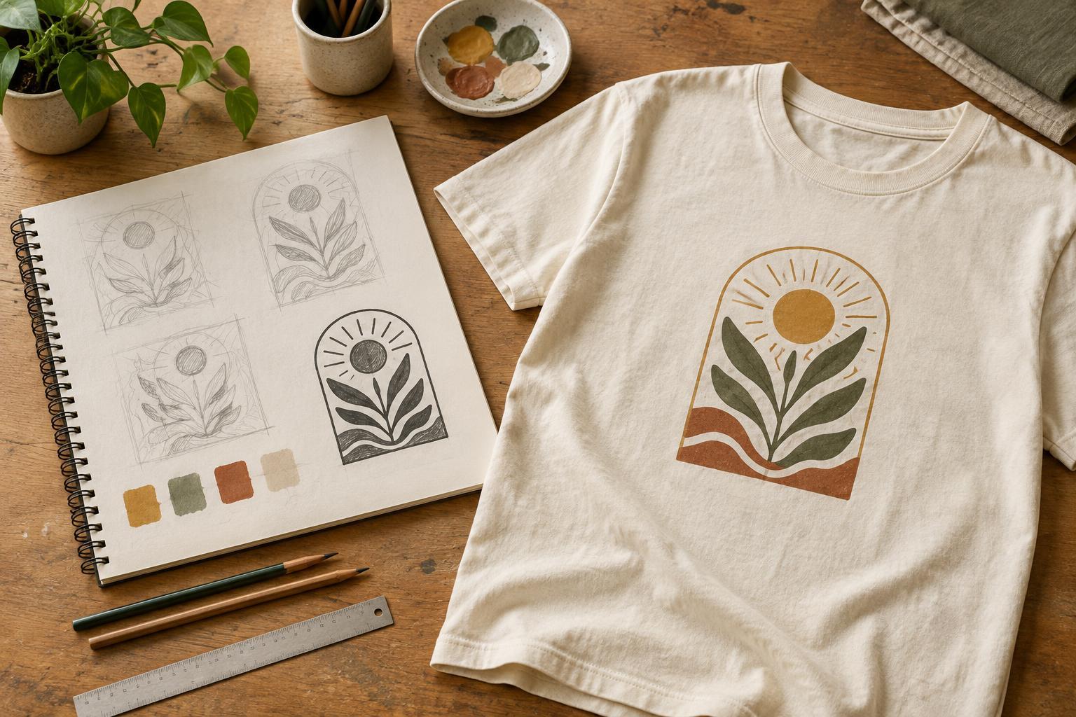
Start with one idea and a few quick sketches
Before drawing details, decide what the shirt should communicate. Is it a bold symbol, a short phrase, a playful illustration or a combination? Think about who will wear it and where. A graphic for a casual group outing may invite a different approach from one intended as an everyday wardrobe piece. Write a one-sentence description of the idea to keep your decisions focused.
Make several small sketches rather than trying to perfect the first one. At this stage, simple shapes and rough lettering are enough. Try different arrangements: an image above the words, type wrapped around a central shape, or a single graphic without text. Circle the options that remain understandable at a glance. Small sketches are useful because they reveal whether a design depends too heavily on tiny details.
Plan for a shirt, not just a blank page
A T-shirt graphic is viewed on a moving, curved surface. Once you have a promising sketch, draw a basic shirt outline and place the design on it. Compare a centered chest print with a small left-chest mark or a larger back graphic. Notice how much empty space each option leaves. Empty space can help the artwork feel intentional rather than unfinished.
Consider the shirt color early. Dark ink on a dark garment may be difficult to see, while a light graphic can stand out strongly on a deep-colored shirt. Contrast also matters within the artwork: lettering should not disappear into an illustration behind it. If the design includes text, check that it is legible at approximately the size you expect it to appear on the garment. A phrase that reads well on a screen may become awkward when reduced.
Refine the artwork without losing its character
Choose one sketch and redraw it more carefully. Strengthen the main shapes, simplify distracting elements and make repeated features feel consistent. If you are working digitally, you can scan or photograph your sketch as a guide, then draw over it. You do not need to remove every trace of a hand-drawn style; irregular lines can be part of the appeal when they look deliberate.
Keep an editable version as you work. Vector artwork is convenient for clean shapes and type because it can be resized without the same concerns as a small pixel image. Raster artwork can suit painted textures or detailed drawings, but it needs enough resolution at the intended print size. Avoid enlarging a tiny image and assuming the extra pixels will restore lost detail. If you use a typeface, confirm that you are permitted to use it for your project and keep a copy of the wording in editable text until the design is settled.
Check the design against the decoration method
Printing and decoration methods handle artwork differently. Screen printing is often considered for designs with distinct areas of color, while direct-to-garment printing may suit artwork with more tonal variation. Transfers, embroidery and other methods introduce their own considerations. For example, fine lines, small gaps and subtle textures may not translate equally well across methods. These are design questions to raise, not reasons to assume a particular result.
If you know who will produce the shirt, ask for their artwork requirements before preparing the final file. Check which file formats they accept, whether they need a transparent background, and how they want colors and dimensions specified. A design made for a pale shirt may also need changes for a dark one, depending on the process. Keep your original artwork separate so you can make those adjustments without rebuilding the graphic.
Review at real size before calling it finished
Print the artwork on ordinary paper at its intended size, if possible, and hold it against a shirt. This simple check can expose lettering that is too small, a graphic that feels too wide, or a placement that looked balanced only on screen. Step back and look again from a normal viewing distance. Ask someone unfamiliar with the idea what they notice first; their answer can help you judge whether the visual hierarchy is working.
Before handing off the file, proofread every word and inspect the edges of shapes for accidental marks. Name your files clearly and include a simple reference image showing the intended shirt color and placement. The reference is a communication aid, not a guarantee that the finished garment will match a screen preview exactly. A strong beginner workflow ends with artwork that is clear, adaptable and easy to discuss with the person producing the shirt.


