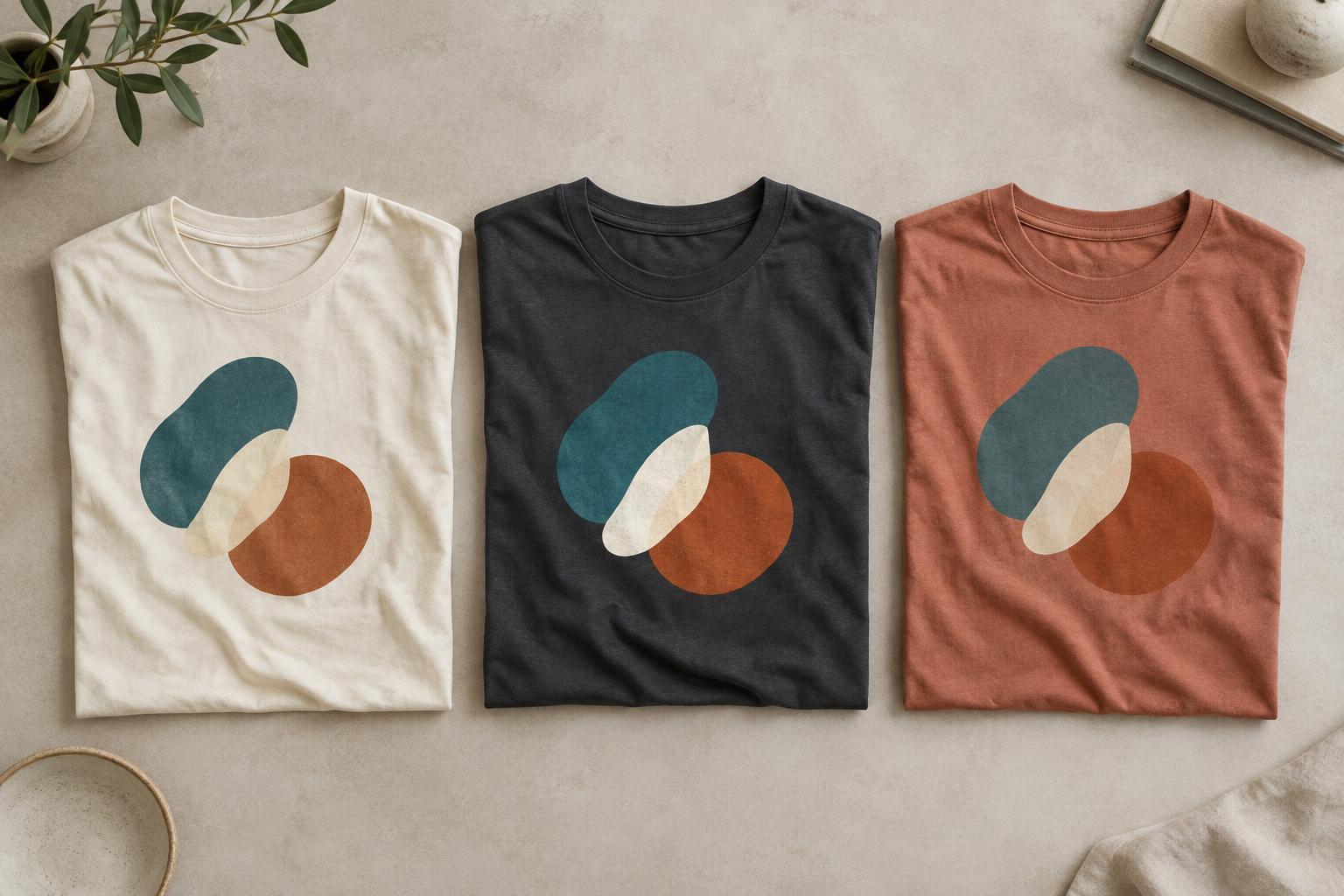
Start with contrast, not just your favorite color
Shirt color is part of a graphic’s background. It changes which parts of the design stand out and which parts seem to recede. A pale yellow drawing may be easy to see on a navy shirt but hard to distinguish on a white one. A black design can look crisp on a light shirt and nearly disappear on charcoal. Neither combination is automatically wrong: low contrast can create a quiet, tonal look, while high contrast usually makes a graphic easier to notice.
Think about how the shirt will be viewed. A small chest emblem needs enough separation from the fabric to remain recognizable at a glance. A large, simple shape can tolerate less contrast because its outline is easier to follow. If the design contains lettering, test whether every word remains readable at the size it will appear on the garment. Choosing colors that look appealing side by side is not enough if the message gets lost.
Notice how the background changes perceived color
The same graphic color can appear different against different shirts. A medium blue may feel bright on black fabric and subdued on a pale blue shirt. Warm colors such as orange can seem particularly vivid beside cool, dark backgrounds. These are visual effects, not necessarily changes to the ink itself, and they help explain why a color combination that works on a white screen background may feel different on a garment.
Shirt color can also become an active part of the artwork. Leaving areas unprinted lets the fabric show through as a shape, an outline or the space between letters. This can make a design feel integrated with the shirt and may reduce the number of printed colors needed. The trade-off is that those open areas will change color whenever you change the garment. If an illustration depends on white clouds, for example, leaving the clouds unprinted will not give the same effect on a green shirt.
Match the palette to the mood
Color combinations influence the character of a design. A cream graphic on a faded-looking dark shirt can feel restrained, while bright colors on a light shirt can feel playful. A single-color print often puts the emphasis on shape and typography; several colors can add depth or distinguish parts of an illustration. These are useful starting points rather than fixed rules. The right choice depends on what the graphic is meant to express.
Build a small palette around the shirt instead of choosing the graphic colors in isolation. Pick a garment color, identify the most important element of the design, and give that element enough contrast. Then choose secondary colors that support it without competing for attention. If you want to offer the same artwork on several shirt colors, consider adjusting the graphic palette for each option. One universal file may not preserve the same balance on both a light and a dark garment.
Account for printing and fabric
A digital mockup is helpful, but it cannot perfectly represent a printed shirt. The decoration method, ink, fabric texture and garment color can all affect the finished appearance. Some printing approaches may use an underbase beneath a design on a dark garment to help lighter colors show clearly. Without a suitable approach, pale artwork may look less opaque than expected. Ask a print provider how the chosen method handles the shirt color rather than assuming every method will produce the same effect.
Fabric surface matters too. A smooth shirt may show thin lines differently from a shirt with a more textured surface, and a heathered fabric can make unprinted gaps look visually busier. Fine detail is especially worth checking when the graphic has low contrast against the garment. When possible, view a physical sample of the shirt color and a print made with the intended method before settling on subtle color combinations.
Test the combination before committing
Place the design on a realistic image or swatch of the intended shirt color, then look at it at both full size and thumbnail size. At full size, check fine lines, small lettering and areas where neighboring colors meet. At thumbnail size, ask whether the main shape and message are still clear. You can also view a simplified grayscale version to judge the light–dark contrast without being distracted by the colors themselves.
Finally, compare the design on each shirt color you plan to use. Pay attention to edges, unprinted spaces and any graphic element that closely matches the fabric. If an element disappears, you might lighten or darken it, add an outline, simplify the artwork or choose another shirt color. The goal is not always maximum contrast. It is to make the relationship between shirt and graphic intentional, so the finished T-shirt communicates the look you had in mind.


