Start with the shirt, not the graphic
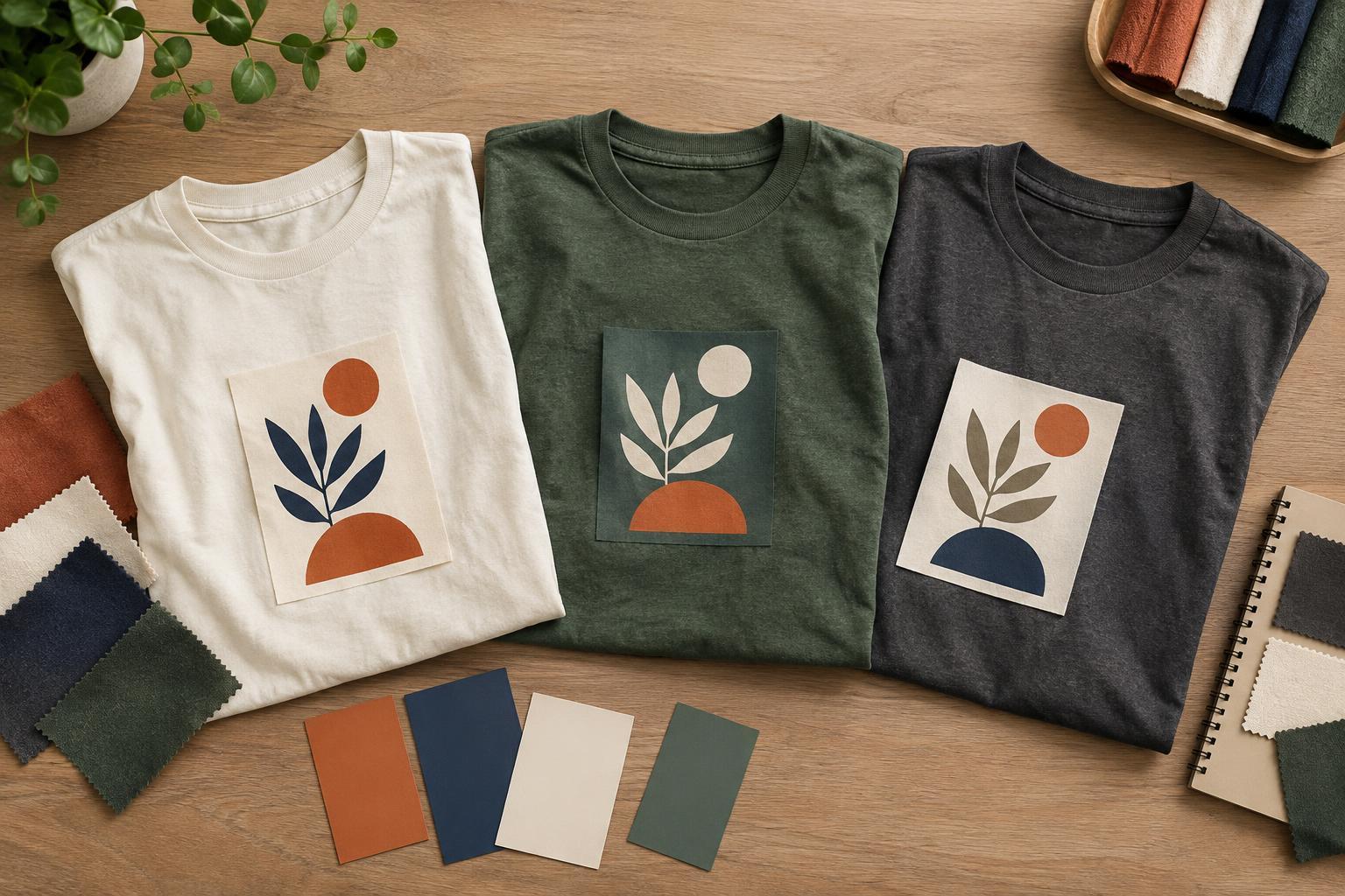
The shirt color is part of the palette, even when no ink or decoration is applied to it. A graphic that looks balanced on a white screen may feel entirely different on a charcoal, cream or bright blue garment. Before choosing colors for lettering or illustrations, decide which shirt colors the design needs to work on. If there will be several options, plan for each rather than assuming one graphic will suit them all.
Next, identify the feeling you want the shirt to convey. Soft, closely related colors can make an illustration feel calm or understated. A bright accent against a quieter base can give a slogan or symbol more energy. You do not need to follow rigid rules about what each color means; context, imagery and the intended wearer matter more. Write down a few descriptive words, such as playful, minimal or bold, and use them to guide choices when several palettes seem appealing.
Make contrast serve the message
Contrast helps people understand a design at a glance. The most important element, often a name, phrase or central image, should stand apart from both the shirt and nearby details. Light lettering on a dark shirt, or dark lettering on a light shirt, is a straightforward starting point. But hue alone is not enough: two different colors can look similar in lightness and cause small text or fine lines to disappear.
Try viewing the design at the size someone might see it from a short distance. Squint at it, shrink the preview or check a grayscale version to see whether its main shapes still separate. These checks cannot predict a finished print, but they can expose weak contrast early. Give small lettering especially strong separation from its background. If an accent color makes a word difficult to read, reserve that color for a larger shape or a less essential detail.
Build a small palette with clear roles
A useful starting point is the garment color, one main graphic color and, if needed, one accent. Give each a job. The main color can carry the text or dominant illustration; the accent can draw attention to a word, border or focal point. Limiting colors does not mean every design must look plain. Differences in shape, scale, spacing and line weight can create interest without adding another hue.
If the design calls for more colors, add them deliberately. Ask what each new color contributes and whether a simpler version communicates just as well. Closely related shades can create subtle depth in a large illustration, while a contrasting accent can establish a clear focal point. Too many equally strong colors may compete for attention. Keep a version of the design with fewer colors alongside the more detailed one so you can compare which reads more clearly.
Consider how decoration may change the look
Screen colors are a planning tool, not a guarantee of how a decorated shirt will appear. Fabric color and texture, ink coverage, thread sheen and the chosen decoration method can all influence the result. A pale color on a dark garment, for example, may need a different production approach from the same color on a light garment. Very fine lines, subtle gradients and tiny areas of similar colors may also be more difficult to reproduce consistently than larger, simpler shapes.
Choose the decoration method before relying on a particular visual effect. A flat graphic with distinct color areas may be easier to adapt across methods than one that depends on delicate transparency or precise tonal shifts. If you are preparing artwork for a print or embroidery provider, ask what file format and color information they need. When a specific shade is important, request a physical sample or proof if one is available, and allow for some difference between a screen preview and the garment.
Test the palette in realistic combinations
Place the design on a preview of each intended shirt color at approximately its planned size. Look at it against both light and dark surroundings, then compare versions side by side rather than relying on memory. Check whether the focal point remains obvious, the smallest essential text is readable and the palette still fits the mood you chose. If one shirt color weakens the design, a separate light or dark version of the graphic may work better than a single universal file.
Finally, step away and return to the options with fresh eyes. Keep the palette that communicates most clearly, not necessarily the one with the most colors. A successful T-shirt design makes the garment and graphic feel like one composition: the shirt provides the background, the main color carries the message and any accents earn their place.


