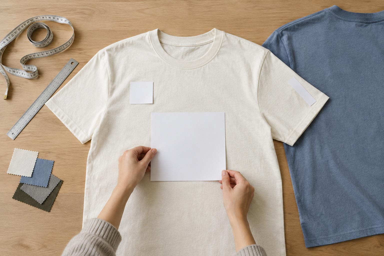
Start with the garment, not a fixed measurement
A print that looks balanced on one T-shirt may feel too large or too low on another. Cut, size, neckline and available fabric all affect how a design sits when the garment is worn. Before choosing dimensions, lay the shirt flat and identify the area that stays relatively smooth across the body. Treat measurements as a starting point rather than a rule that works for every shirt.
Think about the artwork’s shape as well as its width. A tall illustration needs enough room below the neckline, while a long slogan may need more horizontal space than a compact symbol. Keep important details away from seams and edges, where fabric curves or folds. If you are making several garment sizes, check whether one print size looks acceptable on all of them or whether the design needs to be scaled.
Choose a front placement for the message
A centered front print is a natural choice for artwork intended to be noticed first. It can hold an illustration, a short phrase or a combined graphic and text layout. The goal is not simply to make the design as large as possible: leave enough clear fabric around it so the shirt does not feel crowded. Check its position on a worn garment, since a design placed by eye on a flat shirt can appear lower than expected.
A small left-chest print gives a quieter effect and works well for a simple mark or a few readable words. Keep fine detail to a minimum if the print will be small. Also consider how the shirt might be worn: an open overshirt may reveal a chest design while hiding much of a centered print. On fitted garments, avoid placing essential text where stretching could make it harder to read.
Use the back for space or a second layer
The back offers room for a larger graphic, but it asks a different question: what should someone understand as the wearer walks away? A bold shape or concise message is easier to take in at a glance than a dense block of small text. If the front already carries a prominent design, a large back print can make the shirt feel busy. A small front mark paired with a more expansive back design often creates a clearer hierarchy.
Placement matters as much as scale. A design high on the back may be visible above a jacket or backpack only some of the time; one placed lower may be interrupted by folds when the wearer sits. A small print near the back neckline can serve as a subtle detail, though it leaves little room for text. For any back layout, inspect the distance from the collar and side seams rather than centering it by guesswork.
Treat sleeves as a narrow design area
Sleeve prints are best suited to compact elements such as a symbol, short word or simple repeat. The available area changes with sleeve length, garment size and how the sleeve hangs on the arm. A graphic that looks centered on a flat sleeve may rotate out of view when worn, so decide whether it should face forward, outward or slightly backward. Give the artwork breathing room near the hem and shoulder seam.
Printing method can also affect the choice. A large, solid area of decoration may feel different from bare fabric, particularly on a small sleeve, while intricate lines may need adjustment for the chosen process. Ask the printer which areas of the specific garment can be decorated and whether seams, cuffs or fabric texture limit placement. That conversation is especially useful when combining a sleeve detail with a larger front or back print.
Check the layout at real size before committing
Start with a mockup, then test the artwork at its intended physical size. A paper printout held against the shirt can reveal whether text is readable and whether the design overwhelms the garment. Check it from nearby and from a few steps away. Look at the shirt on a person if possible, with arms relaxed, rather than judging only a flat photograph. Repeat the check on more than one garment size when the same design will be used across a range.
Finally, give the printer a clear placement reference: the artwork dimensions, the garment style and a measurement from a consistent point such as the neckline or a seam. Specify whether you mean the top of the artwork or its center. Confirm any method-specific size or placement limits before preparing the final file. These checks cannot guarantee an identical appearance on every shirt, but they make the intended result much easier to communicate.


