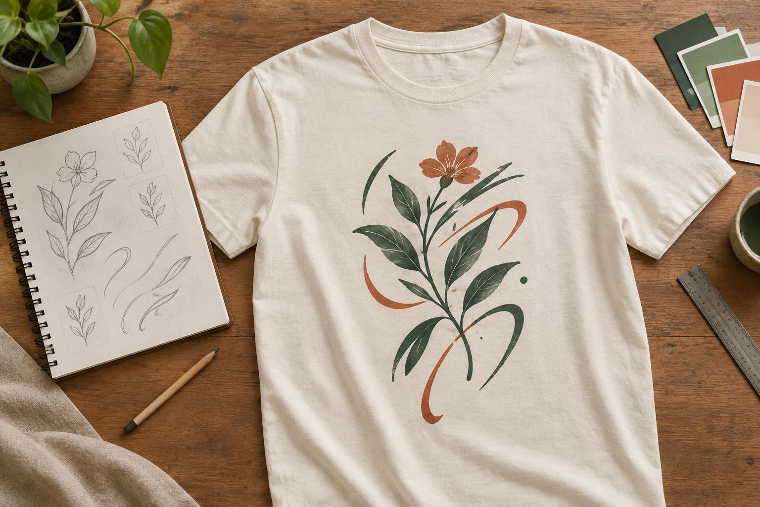
Start with one idea, not two competing elements
A phrase and an illustration can reinforce each other, but they do not both need to explain everything. Begin by writing down the idea the shirt should communicate in a few words. Then decide what the lettering contributes and what the picture contributes. A drawing might establish the mood while the words deliver the punch line. Alternatively, a short phrase might provide context for an image that would otherwise be ambiguous.
Choose a focal point before arranging anything. If the words carry the message, make them easy to read at a glance and let the illustration frame or support them. If the image is the main attraction, keep the wording brief and give it a quieter position. Equal emphasis can work, but it takes more care: two large, detailed elements may compete rather than feel like one design.
Match the character of the lettering and artwork
Lettering has a visual personality even before anyone reads it. Rounded, informal letters can sit comfortably beside playful drawings; restrained lettering may suit a spare, geometric illustration. The match does not have to be literal. Contrast can make a design interesting, provided there is another connection, such as a shared line weight, repeated curves, or a consistent level of detail.
Look closely at the edges of both elements. A loose, textured drawing beside perfectly smooth letters may feel disconnected unless that contrast is deliberate. You could add a little texture to the type, simplify the drawing, or use a common outline treatment. Avoid decorative lettering that is difficult to decipher, especially when the phrase is essential to understanding the image.
Give the words room to breathe. Letters can follow an arc, occupy a banner, or fit around a simple shape, but forcing text into every gap often makes it harder to read. If a phrase is long, consider shortening it rather than shrinking it until it becomes a supporting detail by accident.
Build a layout that works on a person
A T-shirt design is viewed on a moving, three-dimensional surface, not only on a flat screen. Start with a simple arrangement: words above an image, words below it, or a compact composition where type and illustration form a single silhouette. Leave enough space between the elements for each to register, while keeping them close enough to look related.
Think about where the design will sit when the shirt is worn. A wide composition may spread toward the sides of the torso, while a very tall one can feel crowded near the collar or extend farther down than intended. Placement also changes the effect: a small chest design invites a closer look, whereas a larger central design can carry a bolder message. Test the arrangement on a plain shirt mockup rather than judging it only in an isolated artboard.
Use alignment to make the relationship feel intentional. The lettering might share the illustration’s center line, follow its outer edge, or anchor a strong horizontal shape. It need not be perfectly symmetrical. An off-center layout can feel balanced when the visual weight of a dark or detailed image is offset by the position and scale of the words.
Use color and detail to support readability
The shirt color is part of the design. Check whether both the lettering and the illustration stand out against it, and whether one disappears when viewed from a distance. A limited palette can help the elements feel unified: repeating a color from the illustration in the letters creates a connection without adding more shapes. If you want the wording to be the focal point, give it enough contrast without making every part of the artwork equally intense.
Simplify details that do not help the message. Tiny marks, thin strokes, and narrow spaces inside letters may be hard to distinguish once the artwork is applied to fabric. The practical limits depend on the decoration method, garment, and artwork, so review the requirements for the method you plan to use. When in doubt, strengthen important outlines and make small lettering less intricate rather than relying on a screen preview.
Check the design at real size before finishing
Print a paper version at the intended size or view a correctly scaled mockup. Step back, then look again at reading distance. Can you identify the focal point quickly? Can you read the phrase without studying the letterforms? Does the illustration add something to the words, or merely repeat them? These checks often reveal whether an element needs to be enlarged, simplified, moved, or removed.
Finally, inspect the composition in one color as well as in its planned palette. If it still has a clear shape and hierarchy, the underlying layout is likely doing useful work. You do not need to strip away every flourish; you need each flourish to earn its place. A successful pairing feels like one wearable idea, with lettering and illustration making each other easier to understand.


