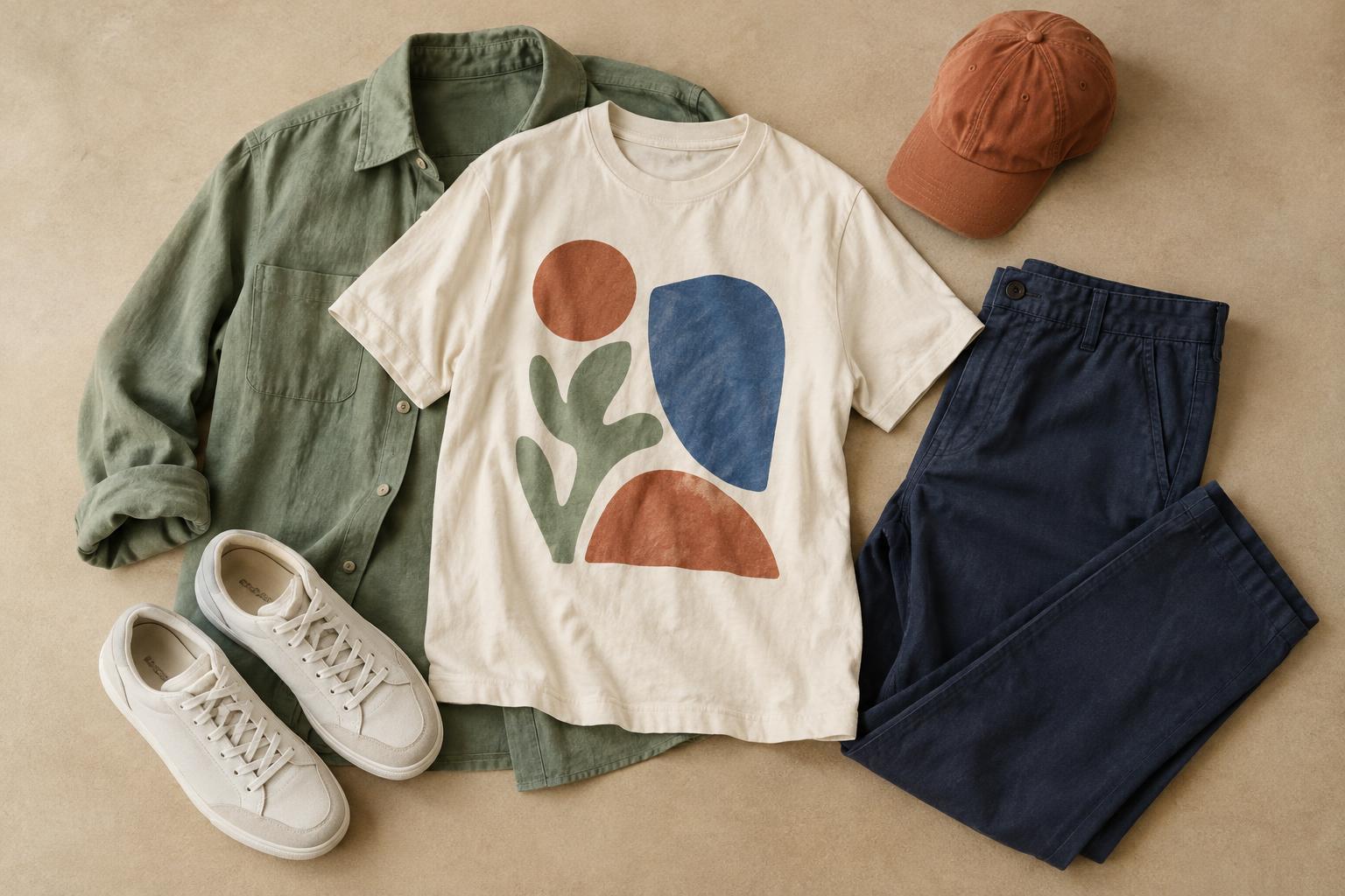
Start with the shirt’s overall palette
Before matching anything to a graphic T-shirt, look at it from a few steps away. Notice the color of the shirt itself, the largest color in the design and any smaller accent colors. A white tee with a large blue illustration will read differently from a blue tee with a small white logo, even though both use the same two colors. The colors that stand out at a distance are usually the most useful starting points for an outfit.
Choose one color to lead and let the others support it. If the print contains several bright shades, you do not need to repeat them all. Picking just one accent makes decisions easier and gives the graphic room to be the focus. You can also ignore an accent entirely and build the outfit around the shirt’s background color.
Use neutrals to give the graphic space
Jeans, plain trousers, skirts and shorts in neutral colors can balance a busy print without making the outfit feel unfinished. Dark denim, black, cream, gray and many shades of brown are useful starting points, but they create different moods. Dark bottoms can make a colorful tee feel more grounded; light bottoms can make the same tee feel softer and more relaxed.
A neutral does not have to be an exact match for a neutral in the design. For example, a cream overshirt can sit comfortably with a white-and-green print even if the whites are not identical. If two near-matching shades look awkward together, add some separation: leave the shirt untucked, choose a layer with a different texture or use a clearly darker or lighter bottom.
Repeat one accent color with restraint
Repeating a color from the print elsewhere in the outfit can make separate pieces feel connected. If a graphic has a small red detail, red socks, a cap or a bag can pick it up without competing with the shirt. The repeated color can be lighter, darker or less saturated than the print; it does not need to be a perfect match.
Think about how much of that color appears on the tee. A tiny yellow detail paired with bright yellow trousers may shift attention away from the design. A smaller accessory might feel more balanced. Conversely, a large block of green in the graphic could work with a green jacket if the rest of the outfit stays fairly simple. These are options to test, not rules that every outfit must follow.
Try contrast when matching feels too predictable
You can coordinate with a graphic without repeating its colors. A warm-toned print can stand out against cool-toned denim, while a pale graphic may become more noticeable beside dark trousers. Contrast in lightness is often easier to manage than combining several strong colors: try one light piece, one dark piece and let the tee bridge the two.
Pay attention to the whole outfit, not just individual color pairs. Patterned bottoms or a striped layer can work with a graphic tee, but both pieces will ask for attention. If the combination feels crowded, choose a quieter layer or look for a shared color between the patterns. Checking the outfit in a mirror from a few steps away helps you judge its overall balance.
Let layers and care support the look
A jacket, cardigan or open shirt can change which parts of a graphic remain visible. An open layer frames a central design; a closed jacket may leave only a hint of color at the neckline. Decide whether you want the image to lead or act as a small detail, then choose the layer accordingly. Shoes and accessories can echo the palette, but they can also stay neutral if the upper half already has enough going on.
Color coordination is easier when the tee looks the way you expect it to. Follow its care label, and consider washing it inside out with similar colors to help limit wear on the print. Let the garment’s fabric and decoration guide drying and ironing choices. A well-kept shirt gives you a more dependable starting point the next time you build an outfit around it.


