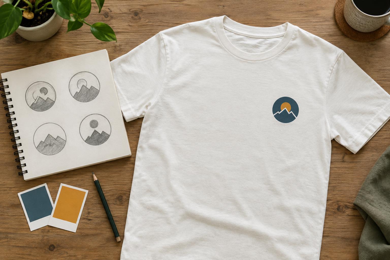
Start with one idea
A badge is a compact design that brings an image, lettering or both into one recognizable mark. It can give a T-shirt the feel of a club shirt, a souvenir or an everyday favorite. Its limited space is also its main challenge: every element has to earn its place. Before drawing, write down what the emblem should communicate in a few words, such as “weekend hiking group” or “neighborhood garden.” Use that phrase to guide your choices.
Choose one main symbol that fits the idea. A trail shape, leaf or simple tool may say more than a collection of tiny illustrations. If the emblem includes a name, decide whether the name or the symbol should be noticed first. A useful test is to describe the design to someone without showing it. If the description takes several sentences, the concept may need simplifying.
Build a shape that holds together
Circles, shields, arches and rectangles offer familiar starting points, but a badge does not need a heavy outline. A curved line of text above a symbol and a short line below it can be enough to suggest a complete shape. Begin with a few rough sketches rather than polishing the first idea. Try versions with and without a border, then compare which one reads most clearly.
Give the parts room to breathe. Keep lettering away from borders, and avoid squeezing small decorative details into every gap. Make the central symbol distinct from its background by using a clear silhouette. Repeating one line weight across the design can help it feel cohesive, while deliberate differences in size can establish a clear order: main symbol first, name second, optional detail last. If a detail disappears when the sketch is viewed small, consider removing it.
Make lettering and color work at shirt size
Text that looks generous on a computer screen can become difficult to read on a shirt. Keep the wording short and choose letterforms with open, recognizable shapes. A name and a brief supporting phrase usually give you more flexibility than a full sentence. Check curved text carefully: letters along the bottom of a circle can look crowded or awkward. If the words have to shrink substantially to fit, simplify the wording or enlarge the badge.
Start with a limited palette and test the design against the actual shirt color, not just a white screen. Light artwork on a dark shirt and dark artwork on a light shirt can each work well when the contrast is clear. Colors that seem different side by side may blend when seen from a distance. A one-color version is a useful design check: if the badge still makes sense without color distinctions, its structure is likely doing enough work. The shirt itself can serve as one of the design’s colors.
Choose placement before adding detail
Placement changes how an emblem feels. A small mark on the left chest tends to read as a subtle identifier, while a larger centered design becomes the shirt’s focal point. A sleeve badge can work as a secondary detail. Sketch the emblem on a simple T-shirt outline at an approximate scale before deciding which version to use. Consider how the design relates to seams, collars and the space a wearer’s arms may cover.
Look at the artwork both close up and from across a room. At a distance, you should still be able to identify its main shape and visual emphasis, even if the smallest text cannot be read. If the badge is intended for a small placement, reduce fine lines, narrow gaps and miniature lettering. Rather than scaling a detailed back graphic down for the chest, make a simpler companion version. This keeps the two placements related without forcing them to carry the same amount of information.
Prepare a design that can be decorated
Printing and embroidery handle detail differently, so think about the likely decoration method while refining the artwork. Fine gradients and delicate texture may be difficult to reproduce consistently across methods; bold shapes and clear spaces are more adaptable. Embroidery in particular benefits from avoiding very small text and intricate lines. The workable level of detail depends on the design size, garment and provider, so ask for the relevant artwork requirements before treating a file as finished.
Keep an editable master with separate text, shapes and colors. If you use a font, check that you have permission to use it for your intended purpose, and avoid copying another group’s logo or badge. Finally, review a mock-up on the chosen shirt color and at the intended placement. Look for cramped lettering, weak contrast and details that do not add meaning. A simple emblem succeeds when it feels intentional on the garment, not merely tidy on a screen.


