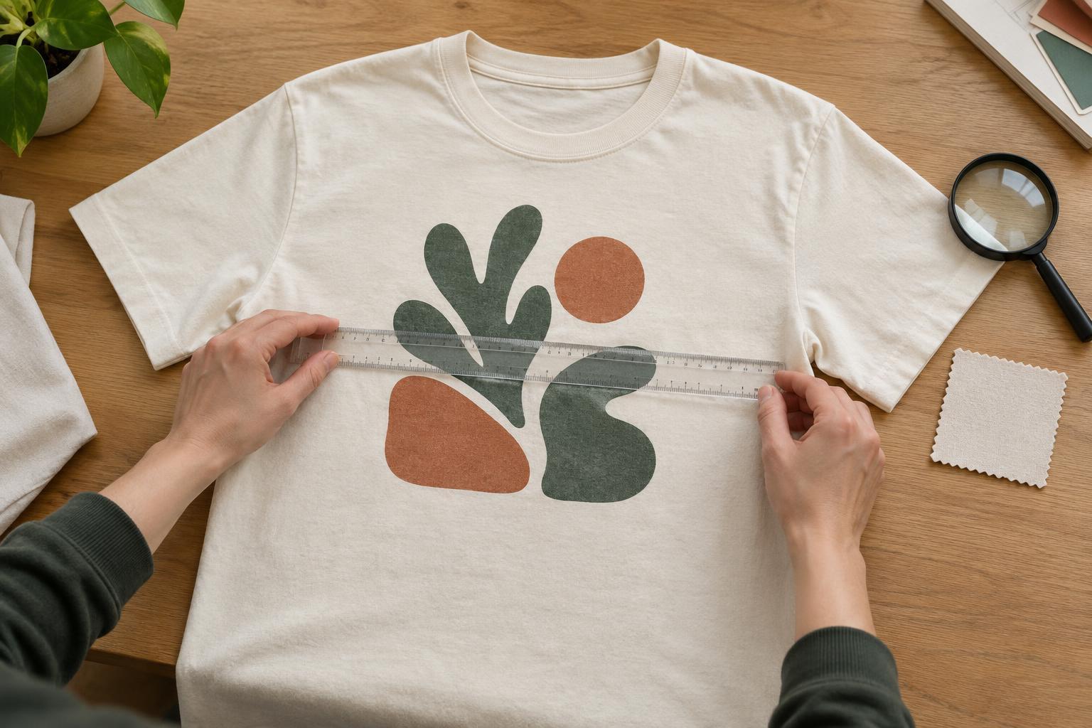
Start with the sample and the intended design
A print sample is most useful when you know what it is meant to represent. Keep the approved artwork, intended print dimensions, garment size and placement notes nearby. Check that the sample uses the fabric colour and decoration method planned for the finished shirts. A design can look different on a dark garment than on a light one, and a sample in another size may not tell you enough about final placement.
Lay the shirt flat on a clean surface and smooth it gently without pulling it out of shape. Inspect it in even, neutral light, then hold it up as someone would wear it. View the design from a normal conversational distance before examining it closely. The first view tells you whether the print reads well; the close view helps you identify the reason if something looks off. Photograph the sample straight on if you need to share feedback, but make decisions from the physical shirt when possible: screens and camera lighting can change how colours appear.
Check alignment against the garment, not just the table
For a centred front or back print, look at its position relative to the collar, shoulder seams and body panels. Measure from consistent reference points on both sides rather than relying only on your eye. Check the distance below the collar and whether the artwork appears level. A shirt that has been folded or stretched can make a straight print look crooked, so smooth it and check again before recording a problem.
Put the shirt on a suitable wearer or dress form if placement is especially important. Fabric can shift when worn, and a print that seems correctly positioned flat may sit too high, low or close to the underarm in use. For pocket, sleeve or wraparound designs, inspect the placement from the angles at which people will see it. Compare the result with the agreed placement rather than assuming every design should be perfectly symmetrical; an intentional offset should still look intentional.
Look for even coverage and clean edges
Coverage is easier to judge when you examine both large solid areas and small isolated marks. Look for unintended gaps, streaks, uneven opacity or garment colour showing through where a solid print was expected. On dark fabric, check light-coloured areas particularly carefully. Some decoration methods and inks produce a softer or more textured appearance by design, so compare what you see with the effect you requested rather than expecting every print to feel like a flat, opaque layer.
Follow the outside edges of letters, shapes and colour blocks. Notice any stray marks, blurred boundaries or visible areas where colours do not meet as intended. If the design uses several colours, look for unwanted gaps or overlaps between them. Examine the shirt from more than one angle: a flaw can be hard to see in the middle of a busy graphic but obvious along a simple border. Note the exact location of any issue so feedback is specific and easy to check.
Inspect fine detail at two distances
Small text, narrow lines and tightly spaced shapes often reveal whether the artwork suits the chosen print method. At close range, check that letters remain distinct, counters inside letters stay open and thin lines have not broken or joined together. Then step back. A technically present detail may still be too small to read on a worn shirt. If legibility matters, judge it at the distance from which someone is likely to see the design.
Pay attention to textures and gradients as well. Check whether intentional dots, shading or distressed areas remain recognisable rather than becoming a muddled patch. Differences between the artwork on a screen and the printed shirt are possible, especially in small or subtle areas. If a detail has changed the meaning or visual balance of the design, consider enlarging it, simplifying it or adjusting the artwork before approval.
Check feel, movement and approval notes
Once the visual checks are done, handle the shirt. Feel whether the printed area is reasonably consistent and inspect it for obvious lifting, cracking or unwanted stiffness. Gently move the fabric as it would move during wear; avoid sharply stretching a sample merely to force a failure. If wash performance is important, ask whether a separate wash-tested sample can be assessed under the care instructions intended for the garment. One sample cannot establish how every shirt will age, but it can help you identify concerns worth discussing.
Write down what passes, what needs changing and what you want to confirm. Include measurements, marked-up photographs and observations such as “small text closes up” rather than a vague request to “make it cleaner.” Agree on any acceptable placement variation or desired hand feel before approving production. If the sample uses different fabric, artwork or a different decoration method from the planned shirts, treat it as a limited preview, not a final approval of details it cannot demonstrate.


