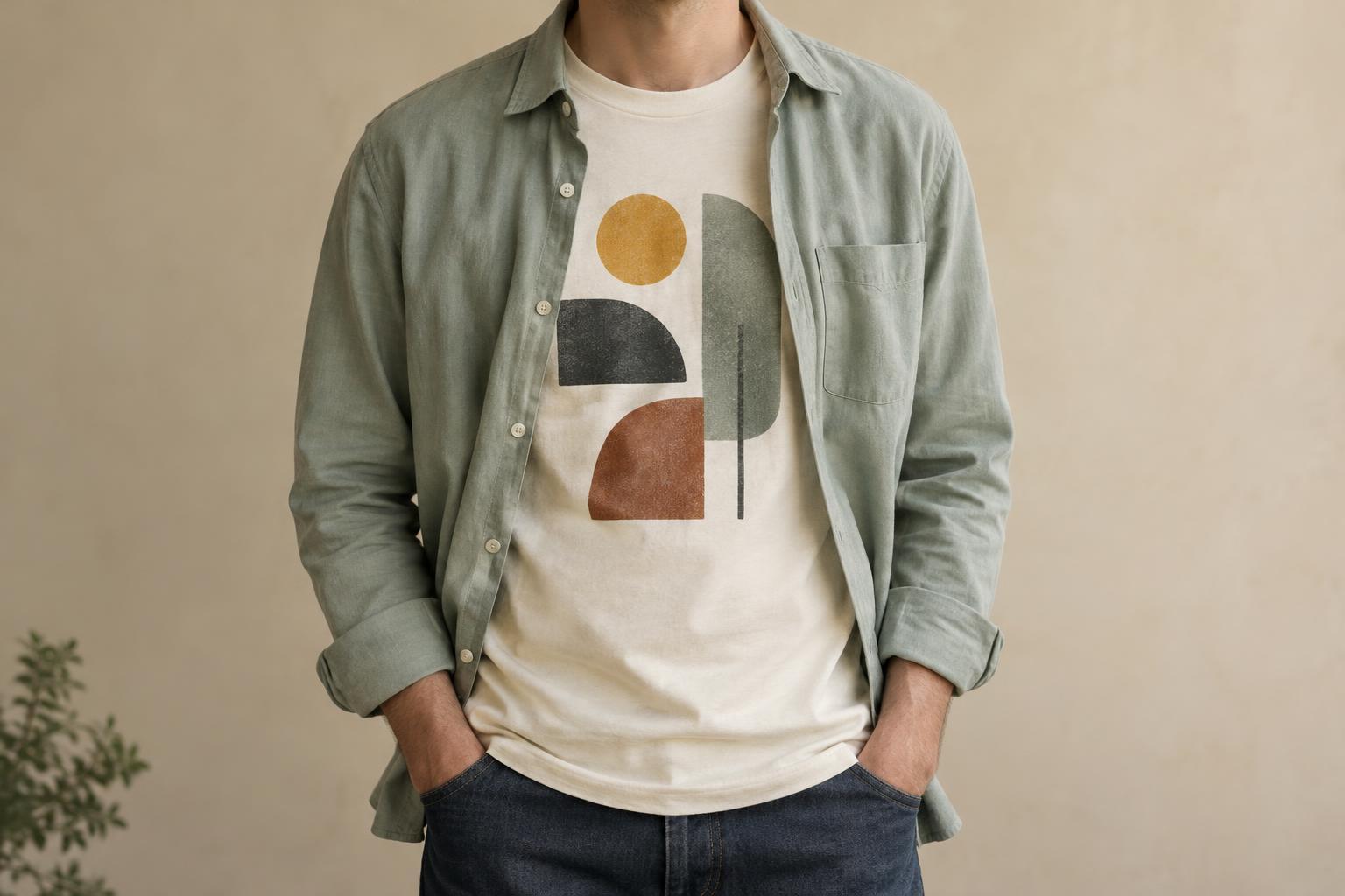
Start with the graphic you want to show
An open shirt works like a frame around a graphic T-shirt. Before choosing the outer layer, put on the tee and notice where its design sits. A small chest graphic may disappear behind the shirt’s front panels, while a wide print may remain partly visible even when the shirt hangs naturally. Neither effect is necessarily a problem: a glimpse of color or lettering can be as effective as showing the whole image.
If you want the design to be readable, look for a print concentrated near the center of the chest and an outer shirt that stays reasonably open. A shirt with a structured collar or slightly heavier fabric may hold its shape better than a very soft one, though movement and wind will still change what shows. For an all-over or oversized graphic, let the open shirt reveal only a portion of it. The result can feel less busy than wearing the tee alone.
Balance the fit of both layers
The tee should sit comfortably under the shirt without bunching at the shoulders, chest or sleeves. If the tee is loose, give it enough room in the outer layer; if it is close-fitting, a relaxed open shirt can create contrast. Try moving your arms and sitting down before settling on the combination. A layered outfit that looks good standing still should also feel easy to wear.
Pay attention to lengths. A tee that extends a little below the open shirt creates a visible edge, while similar lengths give a cleaner outline. A much longer tee can look intentional with a roomy overshirt, but may overwhelm a shorter, neater shirt. You can leave the tee untucked for a casual look or tuck it in to define the waist. Check the outfit from the side as well as the front: an open shirt may fall differently over a printed tee than it does over a plain one.
Use color and pattern to give the print space
A solid-color outer shirt is an easy partner for a detailed graphic. Pick up one color from the print if you want the layers to feel connected, or choose a quiet neutral if you want the artwork to lead. Contrast also matters: a dark open shirt over a light tee can draw attention to the center, while two similar tones make the layers feel more understated.
Patterns can work, but they compete for attention. With a plaid, striped or printed shirt, try a tee with a simpler graphic, limited colors or plenty of blank space around the design. If both pieces are bold, vary their scale: a small repeating pattern is often easier to pair with one large central image than with another dense pattern. There is no fixed color rule; viewing the two pieces together in ordinary light is more useful than judging them separately.
Choose fabric weight for the setting
For warm conditions, a lightweight open shirt over a breathable tee can add visual interest without feeling too bulky. In cooler weather, a flannel or sturdy overshirt provides more coverage. Leave enough space between layers for comfort, especially if the T-shirt has a substantial printed area that feels less flexible than the surrounding fabric.
The texture of the shirt changes the mood of the outfit. A crisp woven shirt can make a playful graphic look more put-together; a soft, worn-in shirt keeps the combination relaxed. Sleeve choices matter too. Rolled outer sleeves expose more of the tee and help the layers look deliberate, while full-length sleeves give a simpler silhouette. If the open shirt keeps sliding off your shoulders or closing over the design, a different cut may work better than repeatedly adjusting it.
Keep the layers looking good
Care for each garment according to its own label, since the tee and outer shirt may have different fabric and decoration requirements. Before washing a printed T-shirt, turn it inside out if its care instructions allow it. Avoid ironing directly over a print unless the garment’s instructions specifically permit it. Let both pieces dry as directed so they keep the fit you chose for layering.
Between wears, check that the open shirt’s collar and front edges lie the way you like. A quick smooth-out can make a casual outfit look more considered. You do not need a perfect match between the two garments: the aim is a comfortable combination that gives the graphic enough room to be seen and lets the open shirt add shape, color or texture.


