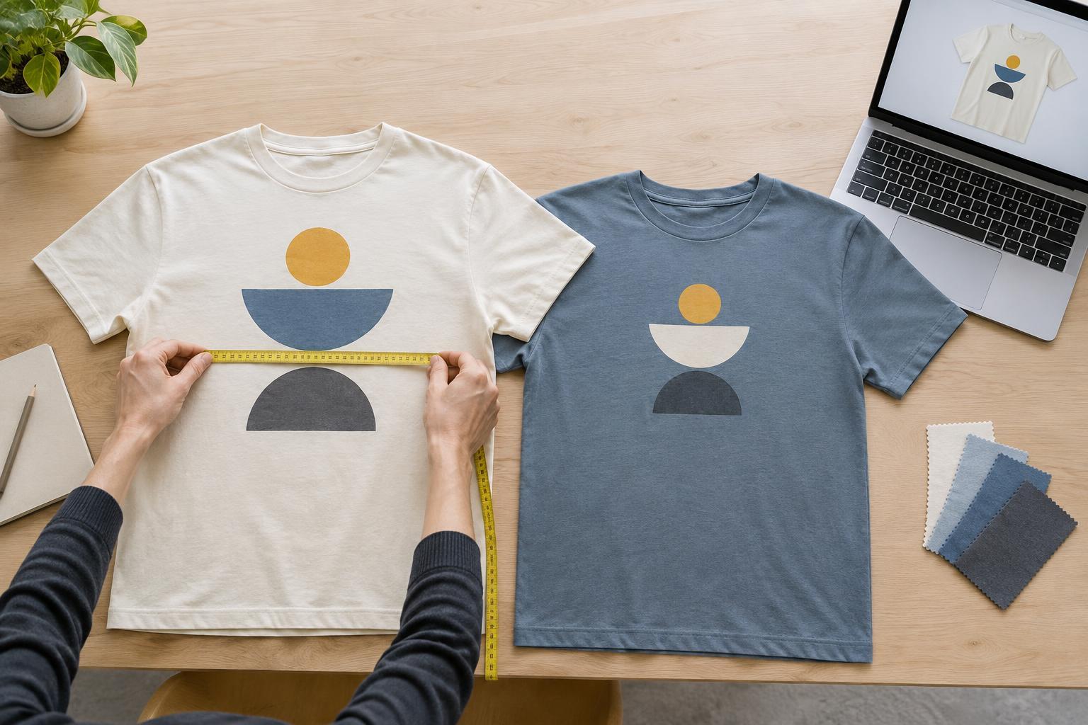
Start with the decision the mockup needs to support
A T-shirt mockup is a preview, not a guarantee of how a finished garment will look. Its value is in helping you answer specific questions: Is the design large enough to read? Does it sit comfortably on the shirt? Does the artwork work with the garment color? Choose those questions before building the mockup, and it becomes easier to judge the result rather than simply admire a polished image.
Begin with the actual artwork file and a shirt image or template that resembles the garment you intend to use. Pay attention to the shirt’s cut, neckline and sleeve length. A graphic that looks balanced on a broad, flat template may feel crowded on a narrower shirt. If you have not chosen a garment yet, make mockups on a couple of plausible fits instead of treating one generic template as definitive.
Show scale and placement honestly
A convincing preview needs more than a design pasted onto the chest. Set an approximate print width and position, then keep those measurements consistent across versions. Note the distance from the neckline to the top of the artwork and whether the graphic is centered on the garment. For a back print, check how it relates to the collar, shoulder area and hem. These reference points make it easier to compare alternatives or discuss placement with a printer.
View the whole shirt as well as a closer crop. A close-up helps you inspect small text and linework, while the full view reveals whether the design dominates the garment or gets lost on it. Include at least one view at the size someone might encounter in a product listing or shared photo. If a slogan is readable only when zoomed in, it may not communicate as intended from a distance.
Use the mockup to test variation deliberately. Place two or three widths or positions side by side on the same shirt image. Changing only one element at a time makes the choice clearer than comparing versions with different colors, sizes and placements all at once.
Check color without trusting the screen too much
Mockups are useful for spotting obvious contrast problems. A dark graphic on a dark shirt may disappear, and a pale color may look less prominent than expected. Try the design on each garment color you are seriously considering, rather than assuming a combination that works on white will work everywhere. Check whether small type, outlines and negative spaces remain distinct.
Screen images cannot reliably predict the exact color or texture of ink, thread or fabric. Lighting in a garment photo, display settings and the material itself can all change your impression. Treat a mockup as a way to narrow choices, not as a color proof. If an exact shade matters, communicate the intended colors to the decorator and ask what references or samples are available for that process.
Keep the comparison fair by using garment images with similar lighting and avoiding heavy filters. A dramatic shadow or warm tint can make one option look more attractive without telling you much about the design. Neutral views usually make it easier to judge whether the artwork and shirt color work together.
Make room for the decoration method
A clean digital image may hide details that matter in production. Fine lines, tiny lettering and subtle color transitions can behave differently depending on the decoration method and garment. Before approving a design from a mockup, consider whether the planned method suits the artwork. For example, embroidery generally calls for a different approach to small details than a printed graphic, while a large solid print may feel different on the shirt from an image with more open space.
You do not need to simulate every manufacturing detail to make the mockup useful. Instead, avoid presenting effects you have not confirmed: a glowing gradient, perfectly sharp microtext or a texture that exists only in the preview. Label versions by intended method when comparing them, and ask the printer about artwork requirements and feasible placement before treating the preview as a production plan.
Review the design in context, then keep a clear handoff
Look at the mockup both flat and, if possible, on a person or a realistic worn-shirt image. Fabric folds and the way a shirt hangs can change the apparent shape of a graphic. A model view helps you judge the overall impression, but it can also distort details, so retain a flat view for placement checks. If you are designing for several shirt sizes, remember that one fixed artwork size may appear proportionally different across them.
Before settling on a version, inspect it at normal viewing size, check spelling and compare the front and back together. Save the artwork separately from the mockup, along with notes on intended garment color, print dimensions, placement and decoration method. The preview helps everyone understand your aim; the separate files and measurements help them act on it. A useful mockup leaves you with fewer unanswered questions, not just a more attractive picture.


