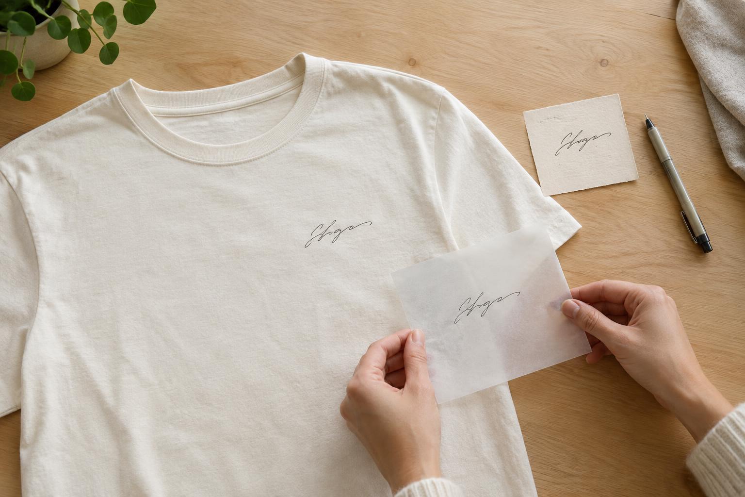
Choose the writing that matters most
A familiar phrase, a brief dedication or a signature can carry more meaning than a complex illustration. Start by deciding what you want the wearer to notice first. A short line may work well across the chest, while a longer note might be easier to read as a larger back print. If the message is personal, consider whether it is meant to be legible to everyone or mainly recognisable to the person wearing it.
Keep the details that give the writing its character: a slanted baseline, an unusual letterform or a small flourish. You do not need to reproduce the entire page. Cropping a note to one sentence can make the design clearer and leave room for a date or name added separately. Before using someone else’s handwriting, especially on shirts made for a group, check that they are comfortable with the message being worn and seen in public.
Make a clean copy of the original
If you can create new writing for the shirt, use a dark pen on plain, light-coloured paper. Write at a comfortable size and leave generous space around the words. Avoid folding the page or writing over textured backgrounds if you can; marks and shadows may be harder to separate from the lettering later. Make a few versions rather than trying to perfect one take. Natural handwriting often looks better than a version that has been retraced repeatedly.
For an existing note, scan it if possible or photograph it in even light. Lay the paper flat, keep the camera directly above it and check that every letter is in focus. Save an untouched copy before editing. Then crop away unnecessary paper, adjust contrast so the strokes are distinct and remove stray marks only where they distract from the message. Examine the image at the approximate size it will appear on the shirt: fine strokes that look clear on a screen may become difficult to see when reduced.
Decide how faithful the design should be
There are two useful approaches to preparing the image. You can preserve the note as an image, including slight variations in ink and line weight, or convert its outlines into a clean digital shape. The first can retain a sense of the original paper and pen; the second may be easier to resize and recolour. Neither is automatically better. If a signature has delicate loops or a message depends on imperfect pen strokes, compare both versions before choosing.
Think about colour and contrast early. Dark lettering on a light shirt is usually straightforward to read, while a pale design on dark fabric may need additional preparation for the chosen printing method. A background that looks white in the file can also create an unwanted rectangle around the writing if it is treated as part of the design. Ask for a preview that shows the artwork on the intended shirt colour, rather than judging the lettering against a blank page alone.
Plan placement and decoration
Print a paper mock-up at the intended size and hold it against a shirt. This simple check helps reveal whether the writing feels too small, stretches too far across the chest or sits awkwardly near a seam. A left-chest signature can feel understated; a larger centred note makes the words the main feature. Leave enough space around the lettering so it does not compete with pockets, collars or other artwork. If several people will wear the design, check it on more than one shirt size.
Printing and embroidery give handwriting different effects. A suitable print method may reproduce small changes in line thickness and intricate letters, although fine details depend on the artwork, fabric and production process. Embroidery adds texture but may simplify thin strokes and tight curves. Tell the decorator which marks are essential and ask whether any letters should be thickened or opened up for the method you choose. If a sample or proof is available, check spelling, scale, spacing and the shape of distinctive letters before approving it.
Keep the message wearable
Choose a shirt that suits how the design will be worn. A soft, everyday tee may be right for a casual keepsake, while a firmer fabric can provide a flatter surface for some designs. Fit matters too: a long line of writing can change shape as the fabric curves around the body. If the note is intended as a gift, an easy-to-wear placement and a comfortable fit may matter as much as faithful reproduction.
After decoration, follow the garment and decorator’s care instructions, since methods and fabrics vary. As a general precaution, avoid harsh treatment of the decorated area and check whether the shirt should be washed inside out or kept away from direct ironing on the design. Keep the original scan and final artwork file as well. They make it easier to adjust placement later without risking damage to a treasured handwritten page.


