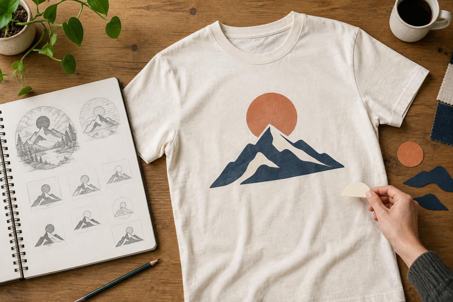
Find the one thing the shirt needs to say
A T-shirt graphic has to communicate while its wearer moves. People may see it from several feet away, at an angle, or only for a moment. That makes a detailed brief a starting point, not a checklist of elements that must all fit on the fabric.
Write your idea as a single sentence before drawing. For example, “a night garden with a curious cat” gives you a clearer direction than a list of flowers, stars, insects, lettering, and decorative borders. Then decide what someone should notice first: the cat, the garden, or a short phrase. If every element is equally prominent, none of them can lead.
Separate essentials from supporting details. Keep what makes the idea recognizable or personal, and set aside details that merely repeat the mood. You can save those for a later version rather than forcing them into one composition. Simplifying does not mean making the idea generic; it means giving its most distinctive feature room to work.
Build a clear visual hierarchy
Start with a rough silhouette or a few large blocks of shape. If the main subject is hard to recognize without facial features, texture, or tiny outlines, its overall form may need work. Strong shapes give the design a foundation that remains legible when printed at a modest size.
Choose one focal element and make supporting elements visibly quieter. You might enlarge the central subject, group small objects into a single shape, or use empty space instead of a decorative frame. Repeating the same detail many times can create visual noise; one well-placed detail may say more. Try a version with half the elements removed and compare where your eye goes first.
Think about the shirt as the background, not just a surface under the artwork. A dark garment can provide the night sky without a large printed rectangle, while a light garment may give an illustration breathing room. The best choice depends on the design and garment color, but using the fabric as part of the composition can reduce clutter.
Edit words and colors with purpose
Text often becomes difficult to read before the illustration does. If your concept includes a long saying, look for its shortest meaningful form. A few memorable words usually have more impact on a moving person than a paragraph. Give the words enough space, and check that the letterforms remain distinct when viewed from a distance.
Limit the type styles you use. A decorative face may suit a short headline, but small supporting text generally benefits from simpler letterforms. Avoid making essential words so small that they function only as texture. If the message depends on reading a caption up close, decide whether that caption is truly necessary.
Color can also establish hierarchy. Begin with the garment color and a small set of graphic colors, assigning each a job: perhaps one for the main subject, one for emphasis, and one for minor detail. Check whether neighboring shapes remain distinguishable. Subtle color differences that look attractive on a bright screen may be less apparent on fabric or under different lighting.
Simplify for the intended decoration method
A design that looks clean on screen may need adjustment before it is decorated on a shirt. Very fine lines, tiny gaps, soft gradients, and small lettering can be harder to reproduce consistently than bold shapes. The practical limits vary with the method, garment, artwork, and production setup, so treat a draft as something to review rather than a guaranteed print result.
If you are considering screen printing, a compact palette and clearly separated shapes can make the artwork easier to plan. Digital printing may accommodate more color variation, but that does not make every small detail useful. Embroidery calls for an even stronger focus on simple forms and readable spacing. Choose the method after identifying what matters most in the design, or adapt the artwork once a method is chosen.
Keep an editable version with separate text and graphic elements. That lets you adjust scale, line weight, or color without rebuilding the whole idea. When preparing a file for someone else to decorate, ask for their artwork requirements instead of assuming one set of specifications fits every process.
Test the design as a shirt, not a poster
Place the graphic on a simple mock-up of the intended shirt color. Look at it at several sizes: close enough to inspect the details, then small enough to resemble a person standing across a room. If the subject disappears at the smaller view, strengthen its shape or contrast. If the composition looks crowded, remove or reposition an element before shrinking everything.
Check placement as well as scale. A centered chest design, a small left-chest mark, and a large back graphic invite different levels of detail. A tiny mark needs an especially clear symbol, while a larger back print may have room for supporting text. Consider how the design sits on a body rather than judging it only as a flat rectangle.
Finally, ask someone unfamiliar with the idea what they notice first and what they think the graphic conveys. You do not need to follow every opinion, but a surprising answer can reveal a hierarchy problem. Keep the version that communicates the intended idea most clearly while still feeling like something a person would enjoy wearing.


