Start with the story, not the numbers
A birthday, anniversary, graduation or first meeting can give a T-shirt a personal meaning. But a date printed large across the chest may tell a stranger very little about why it matters. Before choosing a font, write down what the occasion represents: a shared trip, a favorite place, a new beginning or a tradition. That idea can become the main design, while the date acts as a quiet signature.
For example, a small drawing of a mountain can carry the memory of a hike, with the date tucked beneath the trail line. A simple illustration of a café table can mark where two people met. If the shirt is for a group, a symbol everyone recognizes may feel more connected to the event than a calendar number alone. The goal is not to explain the entire story to every viewer; it is to give the wearer a design they enjoy even when nobody asks what the date means.
Give the date a supporting role in the layout
Treat the date as one element in a visual hierarchy. Decide what someone should notice first, second and third. The main image or phrase might take the largest area, while the date appears in smaller type below it, along an edge or inside a badge. This gives the eye a natural path through the design without turning the numbers into a headline.
Placement can change the mood. A date just below a chest graphic feels like a caption; one on the sleeve feels like a personal detail. A small date near the back neckline can be almost private, especially when the front carries the central artwork. These positions are ideas rather than guarantees: on an actual garment, seams, folds and the available print area may affect how the design sits. Check the design at its intended size and position before approving it.
Choose a date format that fits the design
The same date can look formal, casual or understated depending on how it is written. “June 14, 2020” is immediately readable to many English-speaking viewers, while “14 June 2020” has a compact, editorial feel. Numerals such as “14.06.20” take up less space but may be interpreted differently by people used to another day-and-month order. If clarity matters, spell out the month.
The typeface should belong to the rest of the design. A restrained sans-serif can sit neatly beneath a bold illustration; a softer handwritten style may suit an intimate gift. Avoid choosing a decorative font simply because the date is short. At small sizes, thin strokes and closely spaced digits can be hard to read. If the date includes a year, check that repeated or similar-looking numbers remain distinct when viewed from a normal distance.
Use details to connect the date to its meaning
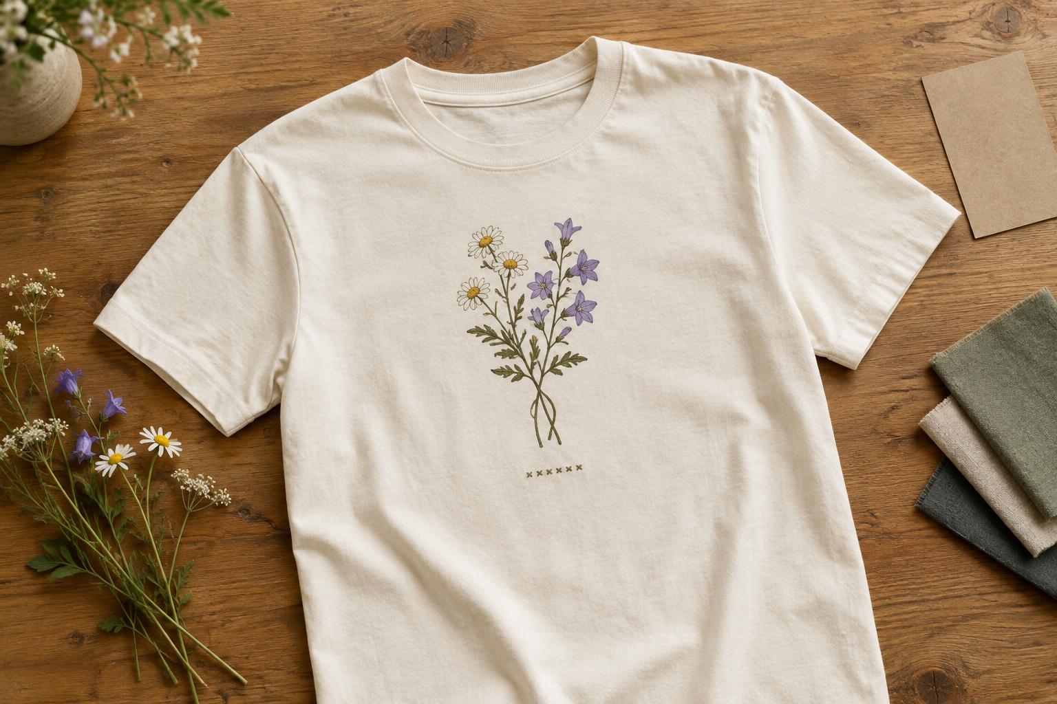
A date feels less isolated when it relates visually to another part of the shirt. It might follow the curve of a drawn horizon, sit on a ticket-inspired label or appear as a small line beneath a place name. You could use a limited set of motifs, such as a flower from a wedding bouquet or a simple outline of a familiar building, without trying to illustrate every detail of the occasion.
Words can help, but they need not turn the shirt into a full explanation. A short phrase such as “Our first summer” gives the date context while leaving the image room to breathe. Try reading every element aloud: if the wording repeats what the illustration already communicates, remove some of it. Leaving open space around the date often makes it feel more deliberate than adding another border, icon or line of text.
Check wearability, privacy and production details
Think about where the shirt will be worn. A date that feels perfect for a one-day celebration may feel too prominent for everyday use. A subtle placement or a design that stands on its own can make the garment easier to wear later. If the date relates to someone else, particularly a child, consider whether they would be comfortable having it displayed publicly. A month and year, initials or a private reference may preserve the meaning without sharing a full birth date.
Before finalizing the artwork, view it at approximately the size it will appear on the shirt. Check the spacing between digits, the contrast against the fabric and whether the date remains legible on a moving, folding garment. Fine lines and very small lettering may reproduce differently across decoration methods and materials, so ask the printer or decorator about their practical size guidance. A good final test is simple: if the date disappeared, would the shirt still be a design you would want to wear? If so, it is probably doing its job as a meaningful detail.


