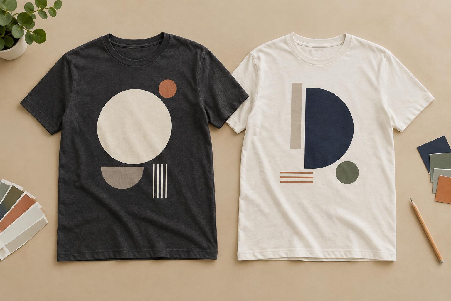
Decide what should catch the eye first
A strong T-shirt design does not need every element to shout. It needs a clear focal point: the word, symbol or image you want someone to notice first. Contrast creates that priority by making one element noticeably different from its surroundings. A bold illustration beside smaller, quieter lettering, for example, gives the eye a place to start before it moves through the rest of the design.
Before choosing colours or effects, decide on the order in which someone should read the artwork. If a phrase is the main message, it may need more visual weight than a decorative border. If the illustration carries the idea, lettering can play a supporting role. Trying to make every part equally bright, large and detailed can leave the design feeling busy rather than expressive.
Use light and dark contrast before relying on colour
The difference between light and dark is often the most useful kind of contrast on a T-shirt. A pale design on dark fabric, or dark artwork on a pale shirt, can be easy to distinguish at a glance. Two colours may look different when placed side by side yet have similar lightness; in that case, their edges can be harder to see, especially in fine lettering or small shapes.
Try viewing your design in grayscale to check whether important elements still stand apart. This does not mean every design must have extreme contrast. Soft, low-contrast artwork can create a subtle look when that is the intention. The key is to reserve enough separation for anything that must be read or recognised quickly. Always judge the artwork against the intended shirt colour, not just against a white design canvas.
Make colour differences serve the message
Colour contrast can direct attention as well as set a mood. A small accent in a vivid colour may become the focal point when the rest of the design uses a restrained palette. You can use that accent for a key word, a distinctive shape or one part of an illustration. Repeating the accent sparingly elsewhere can help the composition feel connected without weakening its emphasis.
Consider how neighbouring colours interact. A saturated colour may appear lively beside a muted one, while two similarly vivid colours may compete. Thin outlines can help separate adjacent shapes, but adding an outline to every element may make the design harder to follow. If you are preparing artwork for a particular decoration method, ask the provider how the chosen colours and fine details are likely to translate; the appearance can vary with the fabric, process and artwork.
Build contrast with size, weight and empty space
Contrast is not limited to colour. A large headline above smaller supporting text establishes hierarchy even in a single-colour design. Thick lettering can hold attention next to delicate lines, while a simple shape may stand out among more intricate ones. These differences are especially useful when you want a limited palette or a design that feels understated rather than colourful.
Empty space matters, too. Giving a central graphic room to breathe separates it from nearby details and from the edges of the printed area. If text sits close to an illustration, both can become harder to distinguish. Try removing a minor flourish or increasing the gap between elements before adding another colour or effect. Contrast works best when viewers can tell which differences are intentional.
Check the design at T-shirt viewing distances
A design that looks clear when enlarged on a screen may feel crowded at its intended size. Preview it on a shirt mock-up in the chosen fabric colour, then look at a small version to simulate a more casual glance. Can you identify the focal point? Can you read the essential words without studying them? If not, enlarge the important element, simplify the background or strengthen the light-dark difference.
Also consider placement and the shape of the garment. A compact chest graphic and a broad back print may need different levels of detail to make their messages clear. Test alternate colourways on each shirt colour you plan to use rather than assuming one version will suit them all. The goal is not maximum contrast everywhere; it is enough contrast in the right places to make your design understandable and give it the character you want.


