Start with the place, then choose its meaning
A location-inspired T-shirt can mark where you grew up, celebrate a shared trip or remind a group of the place where it first met. Before choosing a map or a set of coordinates, decide what the place means to the wearer. A design about a hometown might feel warm and familiar; one about a hiking route might emphasize movement and discovery. That idea will guide which details belong on the shirt.
Choose one clear focal point rather than trying to include every recognizable feature. A street corner, a river bend, a neighborhood name or the outline of a familiar block may be enough. If the connection is private, the design can be subtle: a short phrase, a small symbol and a location reference that makes sense to the people who know the story.
Turn maps into wearable graphics
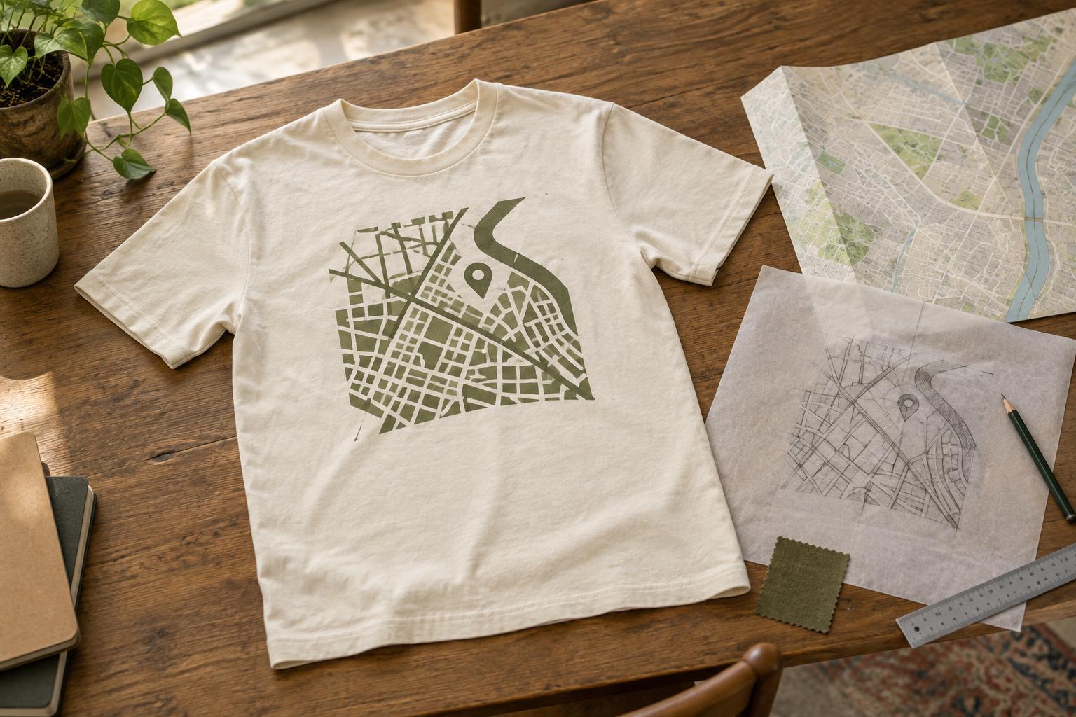
A map works best on a T-shirt when it is simplified. At garment scale, a dense street grid can become a tangle of thin lines, especially when viewed from a few steps away. Try emphasizing a few major roads, the shape of a shoreline or the route between two meaningful points. Remove minor labels and details that do not help tell the story.
Consider how the map will sit on the garment. A compact block of streets can make a centered chest graphic, while a long route may fit better across the back. One highlighted path or landmark can provide contrast without requiring many colors. Before finalizing the artwork, look at it at approximately the size it will appear on the shirt. If the important detail is hard to identify, simplify it further.
If you are using an existing map as a reference, check whether its imagery or styling can be reused. Drawing your own simplified layout is different from copying a map graphic wholesale, but recognizable elements may still need thoughtful handling. When in doubt, build the design from details you can verify and artwork you have permission to use.
Make coordinates meaningful and accurate
Coordinates offer a compact alternative to a map. They can work as a small chest detail, a line beneath a place name or part of a larger illustration. Choose a consistent format, including whether you use decimal degrees or degrees, minutes and seconds. A pair of numbers without enough context may look elegant, but adding a short label can help the intended reader understand why that point matters.
Check what the coordinates actually identify before sharing or printing them. A pin dropped near a destination might land on a neighboring building, the wrong entrance or a less meaningful point. For a personal address, consider using a nearby public landmark or a broader neighborhood reference instead. That preserves the connection without putting an exact private location on a garment worn in public.
Typography matters as much as the numbers. Coordinate strings contain punctuation and repeated digits that can be difficult to scan in a decorative font. Use clear spacing and test the line at its intended print size. If you want a quiet design, small type can work, but it still needs to be readable enough to serve its purpose.
Use neighborhood references with personality
A neighborhood design does not need a literal map. Local character can come through in a familiar nickname, a distinctive building shape, a transit motif or a phrase shared by a community. Choose references that feel specific rather than relying on generic city imagery. A single well-chosen detail often has more personality than a collage of every possible landmark.
Think about who will wear the shirt. An inside reference may be perfect for a reunion or a small group, while a design meant for a wider audience may need a place name to make sense. Keep the tone respectful: a neighborhood is more than an aesthetic, and local names, symbols or cultural references are best used with attention to what they mean to the people connected to them.
Prepare the idea for a real shirt
Once the concept is clear, limit the number of competing elements. Give the map, coordinates or neighborhood reference a clear place in the visual hierarchy, then use supporting text sparingly. Check that fine lines, small letters and closely spaced shapes remain distinct at the intended print size. Different decoration methods and fabrics can handle detail differently, so a design may need adjustment for the garment and production approach you choose.
Test the composition on a simple shirt mockup in the color you expect to use. A line that stands out on a white screen may disappear against a similarly toned fabric. Consider both front and back views, and leave breathing room around the graphic so it feels intentional rather than crowded. The strongest location-inspired shirt does not have to explain an entire place: it needs to make one connection visible and comfortable to wear.


