Start with the person, not the letters
A personalized T-shirt does not need a full name to feel distinctive. One initial can be quiet and graphic; two can suggest a person or partnership; three can create a more traditional monogram. Before arranging the letters, think about who will wear the shirt and where they might wear it. A small mark near the chest can work for an everyday tee, while an oversized initial on the back feels more like a statement.
Check the letters and their order with the wearer, especially for a gift. Some monogram styles place the surname initial in the center and make it larger, but naming conventions and personal preferences vary. An arrangement that looks attractive on a sketch is not necessarily the one its recipient would choose. If you are unsure, a single first-name initial or a straightforward set of initials in reading order is a flexible starting point.
Choose a layout that gives the letters a purpose
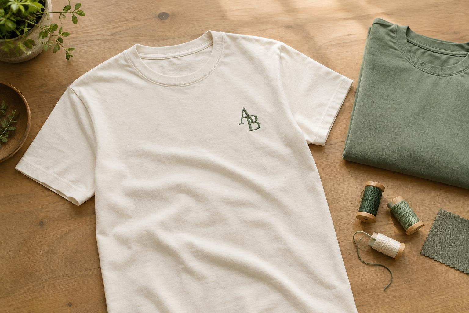
A left-chest initial is a simple option for someone who likes understated clothing. Pair it with a small symbol that matters to the wearer, such as a leaf, star or wave, but keep enough space around the letter for it to remain the focus. For a more casual look, place large initials across the upper back and repeat them at a much smaller size on the front.
There are other ways to make a familiar set of letters feel original. Stack two initials vertically inside a circle, overlap them carefully, or place them at opposite ends of a short line. A letter can also become part of a larger motif: the stem of a flower might echo its shape, or a curved initial might frame a simple drawing. The connection should be easy to see without requiring an explanation.
Try the design at approximately the size it will appear on the garment. A tiny mark that looks elegant on a screen may lose its detail on fabric, while a large interlocking monogram can become difficult to read. Stepping back from a paper mock-up or a full-size digital preview can help you judge the balance.
Make lettering and color work together
Letter style sets the mood. Clean, uncomplicated shapes tend to suit a sporty or modern T-shirt; softer rounded letters can feel playful; decorative scripts can suggest a more formal or nostalgic look. If the initials overlap, prioritize a clear outline for each one. Avoid adding flourishes simply to fill empty space, particularly when the final design will be small.
For an easy-to-wear shirt, consider a design color close to the fabric color, with enough difference that the letters remain visible. A stronger contrast makes the monogram the main feature. You can also give each letter a different color, but limiting the palette helps a compact design feel deliberate rather than busy. View color choices against the actual shirt shade when possible: colors shown alone can feel quite different once surrounded by fabric.
Match the idea to a decoration method
The decoration method can shape the design. Embroidery can give a small chest monogram texture, though fine lines and tiny interior spaces may need simplifying. Printing offers room for larger artwork, layered colors or a graphic that combines initials with an illustration. Heat-applied lettering can suit a crisp, straightforward design. Available detail, texture and feel vary by method and provider, so ask for their artwork guidance before finalizing intricate work.
Garment choice matters too. A smooth, stable area makes it easier to place a design consistently. On a loose-fitting shirt, a chest mark may sit differently when worn than it does when the shirt lies flat. If you are creating several shirts, keep the placement consistent while letting each person choose their own initials or a color they would wear.
Turn a small design into a thoughtful gift
Initials lend themselves to coordinated shirts without making everyone look identical. For a family gathering, use one shared layout and change the letters for each person. For friends, keep the same small symbol beside each set of initials. A pair of shirts might share a color scheme while using different letter placements. These choices create a connection without relying on an elaborate slogan.
The most useful finishing check is whether the T-shirt still looks appealing to someone who does not know the story behind it. Confirm the spelling, letter order, size and placement, then consider how the wearer normally dresses. A personal detail works best when it feels like part of a shirt they would choose to wear again.


