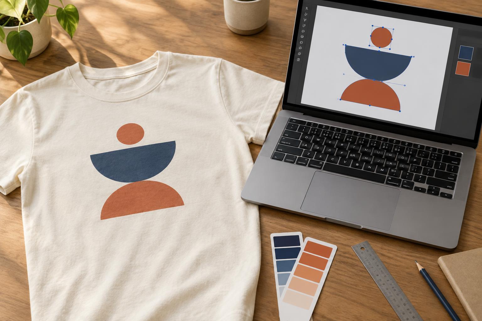
Start with a design that can be inspected and edited
Vector artwork is built from paths and shapes rather than a fixed grid of pixels. That makes it useful for logos, lettering and bold illustrations that may need to appear at different sizes. A vector file is not automatically ready for T-shirt decoration, though. The artwork still needs to be clear at its intended print size, and the decorator needs to be able to identify its colors and shapes.
Before preparing a final file, save an editable copy of the original. Remove unused objects, hidden experiments and stray points outside the design. If a placed photograph or texture is part of the artwork, remember that it remains raster content even when it sits inside a vector document. Keep its original file and check how it looks at the size you expect to use.
Check paths, strokes and lettering
Zoom in to look for tiny gaps, overlapping shapes and accidental outlines. Then view the design at approximately its intended size. Fine details that look attractive on a large screen may be hard to distinguish on fabric. If an element is essential to the message, consider giving it more space or simplifying the shapes around it.
Strokes can behave differently if a file is scaled or opened in another program. When a decorator requests it, convert strokes into filled shapes so their appearance is less dependent on stroke settings. Check the result afterward, especially where lines meet or corners are sharp. Similarly, expand effects such as brushes or complex appearances only after saving an editable version.
Fonts are another common source of changes between files. Keep a working copy with live text so you can revise the wording, and provide a production copy with the lettering converted to outlines if requested. Read the outlined text carefully: converting it to paths preserves its appearance but also makes ordinary spelling edits more difficult.
Plan color for the decoration method
A bright screen color is not a reliable preview of the same color on cloth. Fabric color, ink or thread, the decoration method and the way colors are layered can all affect the appearance. Decide which colors are essential and which can vary. If consistency matters, communicate the intended colors clearly and ask the decorator what color information they use.
For screen printing, it helps to make distinct areas of color easy to identify. Artwork with a limited palette may be simpler to separate than artwork full of subtle blends, but the appropriate approach depends on the printer’s process. For transfers and direct-to-garment printing, gradients and detailed imagery may be possible; they still need review at the intended size. Embroidery generally calls for a different interpretation of vector art, with shapes and lettering considered in terms of stitches rather than printed lines.
Be deliberate about transparency and the garment beneath the design. A shape that looks white on a white digital canvas might represent white ink, or it might be an empty area showing the shirt. Label that distinction in your instructions. On dark garments, ask how the decorator handles light colors and whether the artwork needs any method-specific preparation.
Set the intended size and placement
A scalable design still needs a proposed finished size. Supply its intended width and, if relevant, height, along with a simple placement description such as centered on the front or positioned over the left chest. If you are preparing several garment sizes, ask whether one artwork size will be used for all of them. A design can feel quite different on a small shirt and a large one.
Leave room around important details instead of filling every edge of the available print area. Consider seams, collars, pockets and the way the garment hangs when worn. For a design with very small lettering, make a paper printout at the proposed dimensions and view it from a normal reading distance. This is a useful clarity check, though it cannot predict exactly how the finished decoration will look.
Deliver a clear file and a clear brief
Ask the decorator which file format, color setup and artwork dimensions they prefer before exporting. Common vector formats can preserve paths, but their contents may not transfer identically between applications. Open the exported file to confirm that shapes, lettering and any linked images are present. If images are linked rather than embedded, include the necessary files when requested.
Send the production artwork alongside a straightforward reference image showing the intended appearance on the chosen shirt color. State the proposed size, placement, garment color and any elements that must not change. Keep the editable source file for revisions. A tidy vector file and a short, specific brief give the decorator a better starting point for assessing what the chosen method can reproduce.


