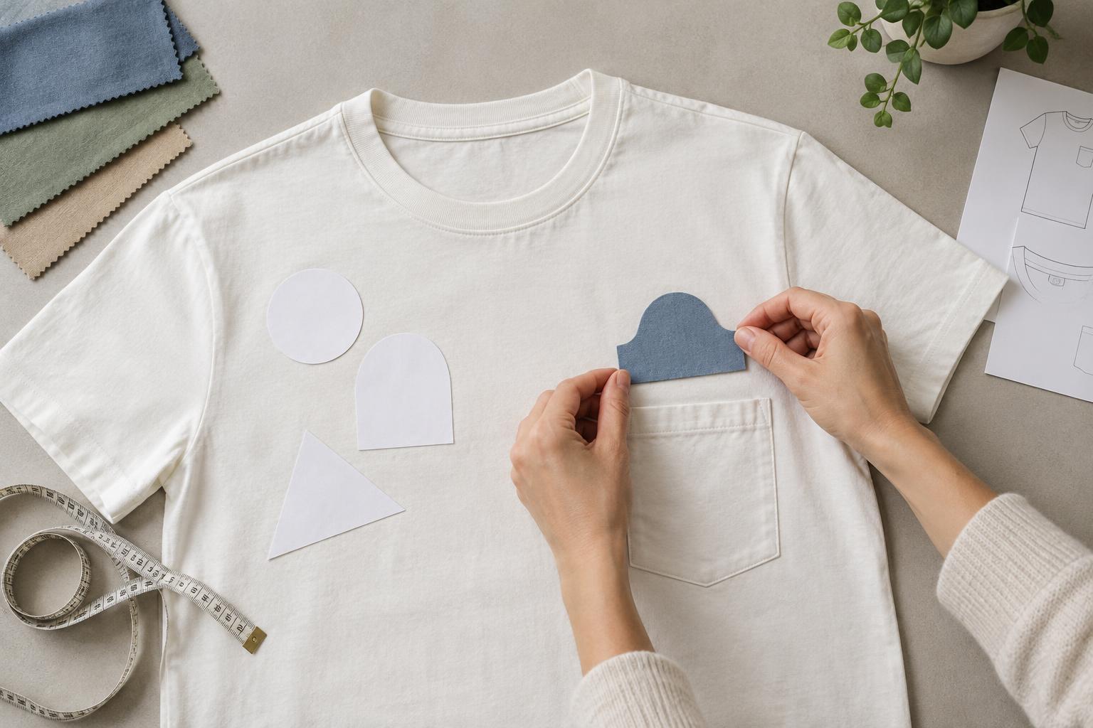
Why garment construction changes the print
A T-shirt may look like a blank canvas when laid flat, but its surface changes at every seam, fold and layer of fabric. A side seam can lift an edge off the printing surface. A collar adds thickness and curves around the neck. A pocket creates a second layer with stitched edges. These features can prevent even contact between a garment and a screen, transfer or press, making nearby decoration less predictable than a print in the middle of a flat panel.
The distance that counts as “near” depends on the garment and the decoration method. A fine line or small lettering may reveal a slight gap or distortion that would be barely noticeable in a loose, textured illustration. Rather than relying on one universal clearance measurement, assess the actual shirt, artwork and equipment together.
Plan around seams and hems
Printing across a side seam can produce an appealing wraparound effect, but the ridge may interrupt ink coverage or leave an uneven edge. The front and back panels can also shift relative to each other when the shirt is worn, so an image that appears continuous on a table may not line up on a body. If the wrap is essential, keep important faces, words and thin outlines away from the seam. Patterns, broad shapes and deliberately broken graphics are often more forgiving.
Similar issues arise at shoulder seams, sleeve joins and bottom hems. Stitching and folded fabric create changes in height, while narrow areas may be difficult to hold flat. For a conventional, crisp print, moving the design inward is usually simpler than trying to print over a construction detail. If the seam is part of the concept, build any irregularity into the artwork rather than treating perfect continuity as a requirement.
Use collar and pocket areas deliberately
A small graphic below the collar can feel restrained, but its position needs to account for the neckline’s curve and the way the shirt hangs. Placing artwork too close to the collar band may make it appear crowded or allow the thicker edge to interfere with application. Check placement on a shirt worn by a person or dress form, not only on a flat template. Neckline shapes and sizes vary, so the same measured distance may look different across garments.
A pocket offers several distinct design choices: print on the pocket itself, print above it, or place artwork on the shirt so the pocket interrupts the image. Each requires a different setup. The pocket’s top opening, seams and extra layer can complicate pressing or printing, particularly near its edges. A small motif centered within the pocket’s usable flat area is generally easier to position than an image that must align precisely across the pocket and body.
If artwork must cross a pocket, decide whether the break is intentional and what should happen when the pocket opens or moves. Avoid putting essential text where the pocket edge could obscure it. Also check whether the intended garment actually has the pocket shape and position shown in the design mockup.
Match the decoration method to the location
Screen printing generally benefits from a stable, flat area so the screen can make consistent contact. Heat-applied transfers also need appropriate pressure and heat across the whole design; raised stitching or a pocket edge can interfere with that contact. Direct-to-garment printing likewise works best when the print area can be held flat. None of these methods should be assumed to produce a seamless result over a ridge or fold.
Small designs in awkward locations may sometimes be applied using specialized platens, pads or other setup techniques. Embroidery offers a different texture and can suit compact motifs, but it brings its own constraints: the garment must be held securely, and dense stitching may distort lightweight fabric. The right choice depends on the shirt’s construction, the detail in the artwork and the equipment available to the decorator.
Check placement before committing
Start with a physical sample of the intended shirt, including its size, pocket style and neckline. Mark the proposed print area with removable tape or a paper cutout, then look at it both flat and worn. Note how seams move when the wearer lifts an arm or turns. For a design offered across multiple sizes, check that its position still looks balanced on a smaller and a larger garment.
Send the decorator an annotated mockup showing the design’s intended relationship to the nearest seam, collar or pocket, along with the actual artwork size. Ask which parts of the area can be held flat and whether they recommend simplifying the design, moving it or changing methods. If precise alignment matters, review a physical test before committing to a larger run. A placement that acknowledges the shirt’s construction is more reliable than one that assumes every panel behaves like flat paper.


