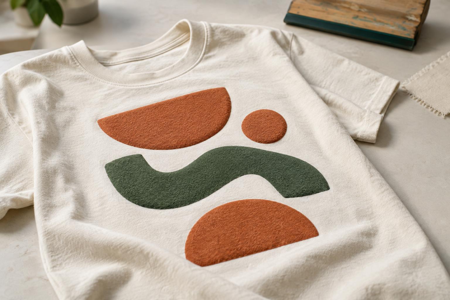
What puff printing changes
Puff printing uses ink formulated to expand when heated during production. The result is a raised surface that you can see and feel. It is commonly used with screen printing, where the artwork is separated into areas of colour and printed through a stencil. The amount of lift and the finished texture can vary with the ink, garment, artwork and production process, so a digital mock-up is best treated as a guide rather than a promise.
Raised ink catches light and creates shadows along its edges. That makes even a simple word or symbol more prominent than the same design printed flat. It also means puff works best when texture has a purpose. A bold headline, mascot outline or small emblem can benefit from lift; applying puff to every part of a complex graphic may make the composition harder to read.
Start with bold shapes and room to breathe
Design for the expanded ink, not just the flat artwork on your screen. Thick lettering, uncomplicated icons and broad blocks of colour usually give the raised surface room to form. Very thin strokes, tiny lettering and delicate illustration details may become uneven or lose definition. Tight gaps can also appear narrower after printing, especially where two puff areas sit close together.
Give counters—the open spaces inside letters such as A, O and P—and gaps between shapes generous room. If you are using a display font, check every character rather than assuming the whole word will behave alike. A typeface with wide openings often makes a more reliable starting point than a tightly compressed one. For a detailed logo, consider raising only its boldest element and printing smaller supporting text with flat ink.
Gradients, fine halftones and intricate textures are less natural fits for a noticeably raised finish. Instead of trying to reproduce every subtle transition in puff, simplify the artwork into clear silhouettes and distinct areas of colour. You can keep fine detail in a separate flat-ink layer if the design needs it.
Use contrast and colour deliberately
Puff ink already adds visual contrast through its height, so it does not need to cover a large area to make an impact. Try choosing one focal element: a word, border, number or graphic shape. Leaving nearby areas flat gives the eye a comparison and helps the raised detail stand out. A restrained palette can be especially effective when the design relies on texture rather than many colours.
Think about the garment colour as part of the composition. Ink close in colour to the shirt can create a subtle, texture-led effect, while a contrasting colour makes the shape easier to spot from a distance. Neither choice is automatically better. If legibility matters, judge the artwork at the size someone is likely to see it, not only while zoomed in on a screen. Printed colour and surface appearance can differ from a screen preview, so discuss any essential colour expectations with the printer.
Plan placement around how the shirt moves
A raised print sits on a flexible garment. Think about how the design will look when the shirt hangs naturally and when someone wears it. A compact chest emblem or a focused section of a larger front graphic may be easier to incorporate than an extensive raised area across the torso. Placement near seams, folds or areas that bend frequently can affect how the texture looks and feels.
There is no universal maximum size or ideal position for puff artwork. The design, garment and printer’s process all matter. Before finalising the layout, view a mock-up at realistic scale and check whether the raised element supports the overall design. If the print is for a group, consider whether the artwork remains clear across the range of shirt sizes you expect to use.
Prepare a design that can be reviewed and tested
Provide clean artwork with distinct shapes and clearly identify which areas should use puff ink. If other parts should remain flat, mark that distinction rather than relying on a mock-up alone. Vector artwork is useful for crisp lettering and shapes, though the printer can advise on acceptable file formats. Avoid building essential details out of hairline strokes or slivers of empty space that may be difficult to preserve.
Ask the printer to review the artwork before production, particularly if it includes small text, closely spaced elements or multiple print effects. For a project where texture is central to the design, a physical sample can help you assess the actual height, readability and feel on the chosen garment. Puff printing is most convincing when its limitations become design decisions: simplify where needed, reserve the lift for a focal point and let the raised surface do some of the visual work.


