Start with the memory, not the merchandise
A reunion T-shirt has two jobs: it should mean something to the people gathering, and it should still feel comfortable to wear after the event. Start by asking what the group actually shares. The school name, graduation year, an old mascot or a familiar building may be enough. A design does not need to reproduce every detail of school life to feel personal.
Choose one or two references that most classmates will recognise, then consider how they will read to someone who was not there. A line drawing of the school entrance, for example, can work as a simple graphic even without its backstory. An inside joke may get a laugh at the reunion but feel less appealing on an everyday shirt. If a phrase needs a long explanation, it might be better suited to an event sign or programme.
Make nostalgia feel current
The most wearable approach is often to treat a school reference as a design element rather than a complete uniform revival. A small crest-inspired graphic, restrained lettering or an illustration in a limited colour palette can evoke the past without making the shirt look like a costume. You could place a modest symbol on the front and reserve fuller reunion details for the back.
Think about where someone might wear the shirt next: on a weekend walk, while travelling or under an open overshirt. If the design feels too event-specific for those settings, simplify it. The reunion year can be smaller than the main graphic, or the school name can sit alongside a more general phrase about coming together. This keeps the occasion visible without making it the only thing the shirt communicates.
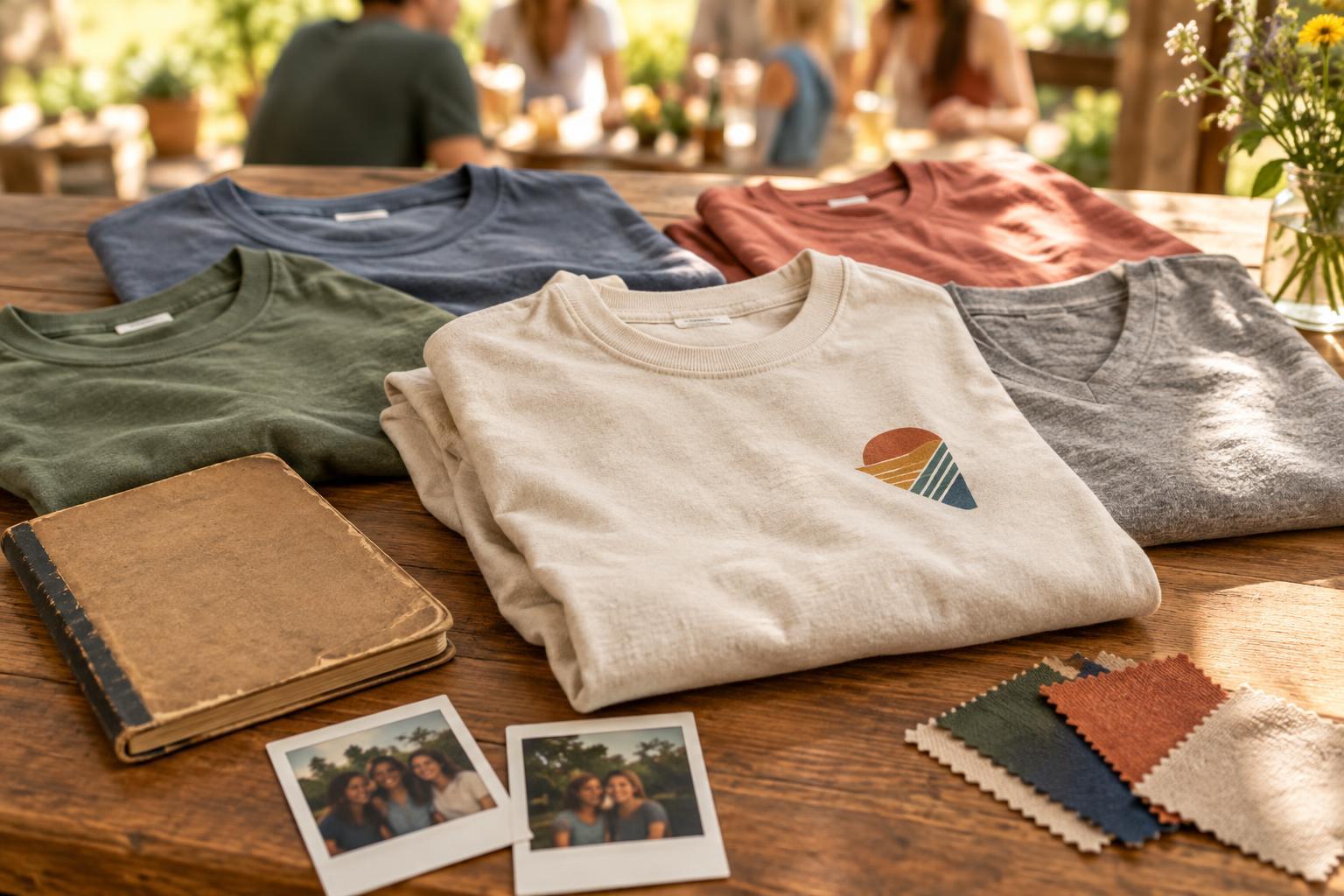
Colour also shapes the balance. School colours provide an obvious starting point, but they do not have to dictate the entire garment. A neutral shirt with one school-colour accent may suit more wardrobes than a large, high-contrast print. Before settling on a palette, look at the design at its intended size: fine lines, small lettering and closely matched colours may be harder to see on fabric than on a screen.
Design for the whole class
A shared shirt should not depend on a memory that only one group of friends understands. Avoid references that single people out, revive an unkind nickname or assume everyone had the same experience at school. If you want to include classmates’ names, ask for permission and check spelling rather than relying on an old list. A name-free design is often easier to approve and remains useful for anyone who joins the event late.
Give people a little choice without creating dozens of unrelated versions. For example, keep one core graphic but offer two shirt colours, or make the front design consistent while allowing a small optional name or graduation year. If an organiser needs a way to identify volunteers, consider a separate badge or accessory instead of changing the main shirt. A consistent design helps the group feel connected; limited options make it more likely that individuals will enjoy wearing theirs.
Choose a shirt that supports the design
The blank garment matters as much as the artwork. A soft-feeling shirt may encourage repeat wear, while the right cut will depend on personal preference. Offer a size guide for the specific shirt being considered, since labels alone do not tell everyone how a garment will fit. If possible, include more than one fit option and explain whether the print placement changes between them.
Match the decoration method to the artwork and likely order size. Simple lettering and solid shapes can suit several common printing approaches; a detailed illustration or many colours may call for a different setup. Ask the printer what file format, minimum line thickness, print area and colour information they need. Their production requirements can help you adjust the artwork before it becomes an order. Also consider care instructions: a design that needs unusually delicate handling may be less convenient as an everyday shirt.
Check the details before everyone commits
Share a clear mock-up that shows the front and back, shirt colour, approximate print size and placement. Ask for feedback on specific decisions rather than inviting an open-ended redesign: Is the school name correct? Is the year right? Can the smaller text be read? Set a reasonable point after which changes stop, so the final version does not drift away from what the group approved.
Before ordering, confirm the final artwork, garment options, size quantities and any personalised text in writing. If a sample is available and practical for the group, use it to assess placement, legibility and fit rather than assuming the screen preview tells the whole story. The best reunion shirt does not have to capture every memory. It needs one clear idea, a comfortable garment and enough restraint to let people make new memories while wearing it.


