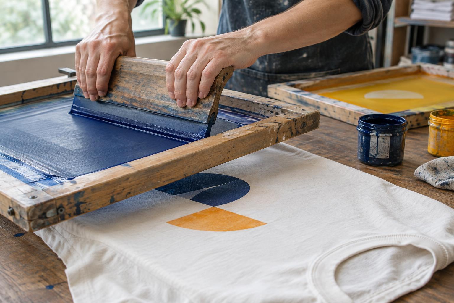
From artwork to a mesh stencil
Screen printing starts with a design and a screen: a frame holding a taut, fine mesh. The printer blocks parts of that mesh to create a stencil. Ink can pass through the open areas but not the blocked ones, transferring the design to the shirt beneath. In a common preparation method, the mesh is coated with a light-sensitive emulsion. Artwork is placed over it during exposure, and the unexposed areas are washed away to make the openings.
A separate screen is generally prepared for each printed colour. A simple one-colour graphic therefore needs less setup than a design with several colours. The artwork also has to be separated into the areas each screen will print. This is why a design that looks effortless on a monitor may require careful planning before it can be printed on fabric.
How ink reaches the T-shirt
For printing, a shirt is positioned on a flat support called a platen. The screen is lowered over the print area, ink is placed on the mesh, and a squeegee draws the ink across it. Pressure pushes ink through the stencil openings onto the fabric. The screen lifts, and the process repeats for the next shirt. Keeping garment placement and squeegee movement consistent helps a run look uniform, although fabric texture and production conditions can still cause small variations.
With multiple colours, the printer aligns the screens so their printed areas sit in the intended positions. This alignment is called registration. Layers may need intermediate drying or heating before another colour is added; the finished print also needs curing appropriate to the ink being used. On a dark shirt, a lighter base layer is sometimes printed beneath bright colours to help them stand out. That extra layer can affect the print’s feel and adds another production step.
Why print-run size matters
Screen printing involves work that happens before the first finished shirt appears: preparing artwork, making screens, setting up the press and checking placement and colour. Once that setup is complete, the same screens can be used repeatedly for a consistent design. Spreading the setup across more shirts often makes the method more practical for a larger run than for a handful of individually different shirts.
The key word is “same.” Changing a name, number or illustration on every garment usually interrupts the repeatable process and may call for a different decoration method or a combination of methods. Likewise, adding printed colours generally means more screens and more steps. When comparing options, consider the number of garments, the number of ink colours, the shirt colour and whether every item needs identical artwork. The best choice depends on the whole job, not just the design’s appearance.
Designing with the process in mind
Bold shapes, clear lettering and deliberate colour choices are natural starting points for screen-printed artwork. Fine lines, tiny gaps and very small text can be harder to reproduce reliably on textured fabric than on a smooth screen display. If a detail matters, judge it at the size it will appear on the shirt rather than at a magnified size on your computer.
Gradients and photographic effects are possible in some screen-printing workflows, often by turning tones into patterns of small dots called halftones. They require more planning than a solid-colour graphic and may look different depending on mesh, ink, fabric and artwork preparation. Colour overlaps also deserve attention: a small shift between screens can be noticeable when two shapes are meant to meet precisely. A design with comfortable spacing, or an intentional overlap, can be more forgiving.
Fabric and fit matter too. A soft, uneven knit may show fine details differently from a smoother surface, while seams and garment shape can limit where a flat screen can print cleanly. Before settling on a layout, think about how the image will sit when the shirt is worn, not only when it is laid flat.
Choosing and caring for a finished print
A useful print plan states the intended garment colour, print location, approximate design size, number of ink colours and quantity. If matching a particular shade or preserving fine detail is important, discuss those priorities before production. An on-screen preview can show placement, but it cannot fully convey how ink will look and feel on the chosen fabric.
Care instructions depend on the garment and ink, so follow the label and any guidance supplied with the finished shirt. As a general precaution, turn printed shirts inside out, use a gentle wash when appropriate and avoid ironing directly over the artwork. Thoughtful artwork, realistic expectations and suitable care all help a screen-printed design remain enjoyable to wear.


