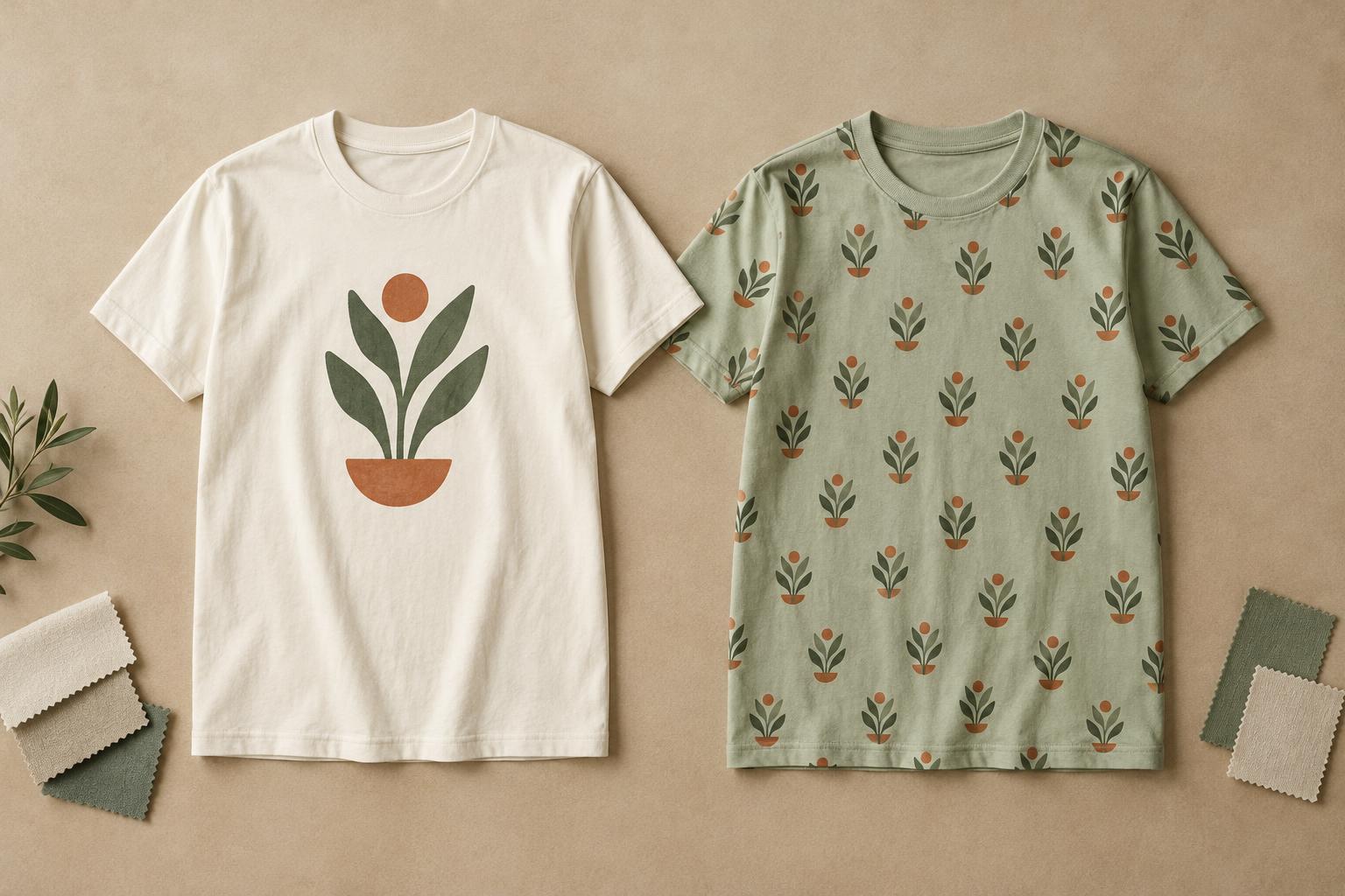
Start with the job your design needs to do
A single motif is one main visual element, such as an illustration, wordmark or small emblem. It might sit at the centre of the chest, over a pocket area or across the back. An all-over pattern repeats or spreads visual elements across much more of the garment. Neither approach is inherently more creative: they give the wearer and viewer different experiences.
Choose a motif when you want someone to notice and understand one idea quickly. A clear symbol, short phrase or detailed drawing benefits from a defined area and some empty space around it. Choose a pattern when the overall mood matters more than any one element. Small shapes, scattered illustrations and repeated lettering can give a shirt character without asking the viewer to focus on a single point. Before sketching, decide what someone should notice first from a few steps away.
Think beyond a flat rectangle
A T-shirt changes shape when it is worn. A centred motif may look balanced on a flat mockup but sit differently across a curved chest or a relaxed fit. Its position should make sense in relation to the neckline, sleeves and hem, not just the edges of the artwork file. If text is essential, leave enough room around it that folds and movement are less likely to interrupt it.
An all-over pattern has a different challenge: its rhythm needs to hold together across the garment. A repeat that looks tidy on a screen may create an awkward row at the hem or cluster noticeably at the side. Decide whether the repeat should be regular or deliberately loose, and check how large its elements appear at actual garment scale. A pattern need not cover every visible area; a designed print area can still create an expansive effect.
Match the artwork to the decoration method
The intended production method can influence the design long before the artwork is final. A motif usually has a defined placement and may suit several decoration methods, depending on its colours, detail, size and the garment. A small embroidered emblem, for example, calls for simpler shapes than a large printed illustration. Fine lines and tiny lettering deserve particular attention because their appearance can vary with the method and material.
An all-over look may require a process that decorates fabric panels before assembly, or it may be built from a print area on an existing shirt. Those routes can produce different results around seams, collars and sleeves. Do not assume a pattern will align perfectly where pieces meet, or that every garment construction supports edge-to-edge coverage. If you plan to have shirts made, ask the provider for its artwork specifications and available print areas before committing to a layout.
Let colour, fabric and styling guide the choice
The shirt colour is part of the composition. A single motif often uses the fabric as generous background space, so contrast between artwork and garment is important. A pattern occupies more of the visible surface and can make even a simple outfit feel busy. Try viewing the design at a distance and at a small scale: if its main idea disappears or its colours merge, simplify the artwork or adjust the contrast.
Fabric and fit also affect the impression. Texture, stretch and drape can change how crisp artwork appears and how a pattern falls across the body. A loose shirt gives a large pattern room to move, while a more fitted cut may bend repeated shapes around the torso. Think about how the wearer might pair the shirt with a jacket, open overshirt or accessories. A small chest motif can remain visible under a layer; a broad pattern may work best when the shirt is the outfit’s main feature.
Make a choice, then test it simply
If you are undecided, draw the same concept both ways. Turn a favourite illustration into one prominent motif, then extract two or three of its shapes for a repeat. Compare them at realistic size on front and back mockups. Ask whether the idea still reads clearly, whether the layout suits the intended wearer and whether you would want to see the design across an entire shirt.
For a motif, check placement, scale and the amount of breathing room around the artwork. For a pattern, check spacing, repetition and what happens near edges and seams. Viewing both options on light and dark garment colours can reveal problems that a single mockup hides. The better choice is the one that supports the idea and the way the shirt will be worn—not simply the one that fills more space.


