Two ways to build a printed image
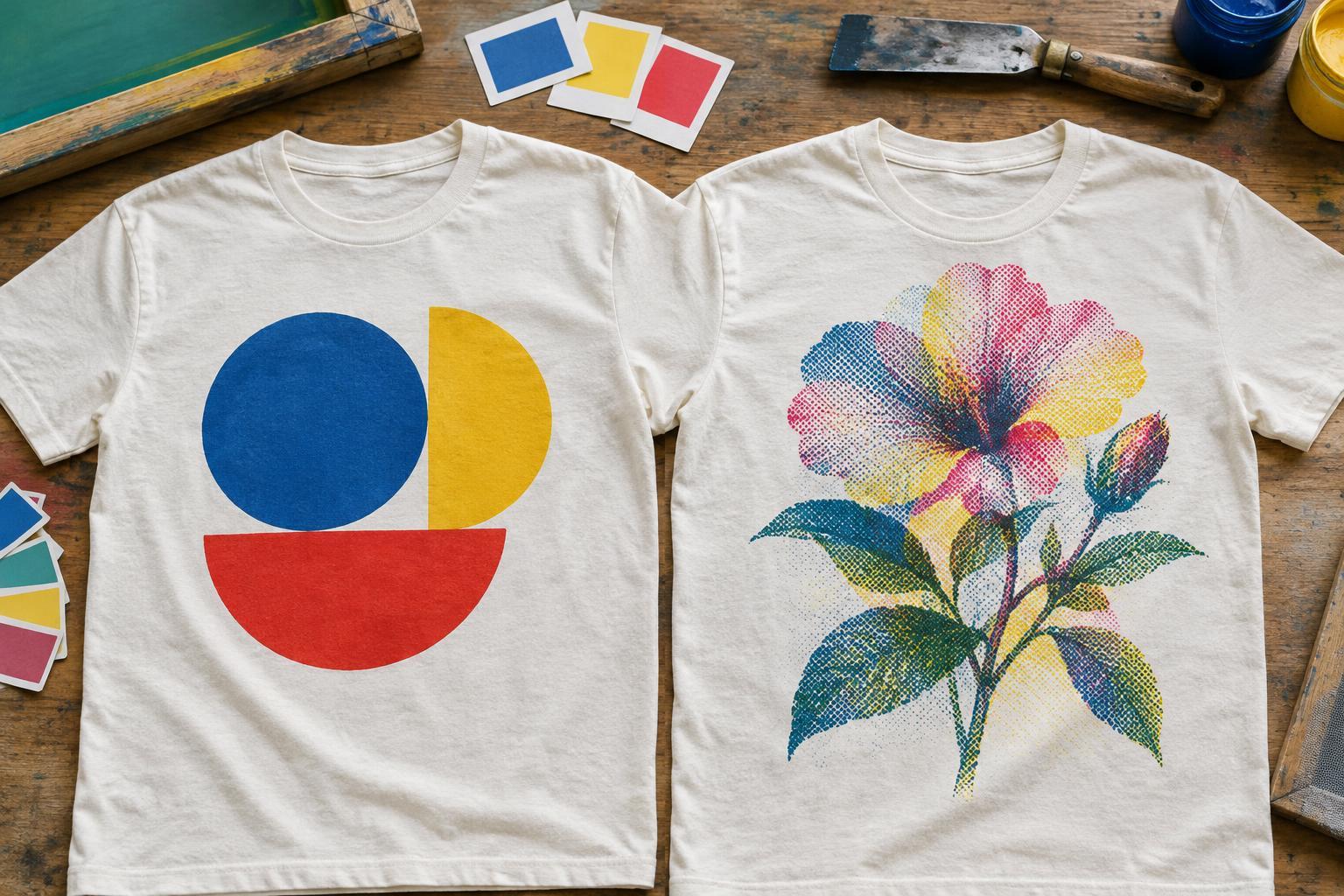
A T-shirt design can look like a single image on screen, but a printer must decide how to create its colors on fabric. In screen printing, spot-color and process-color printing take different approaches. A spot-color design assigns a separate ink to each chosen color. A process-color design uses small dots of a limited set of inks to create the appearance of many colors.
Neither approach is automatically better. The useful question is what the design needs to show. A simple emblem with a few bold colors presents a different printing challenge from a photograph with gradual changes in light and shade. Understanding that difference can help you design artwork that is easier to discuss with a printer and more likely to match your expectations.
When spot colors make sense
With spot-color screen printing, each color in the artwork is separated for printing with its own ink. This suits designs with distinct shapes and a limited palette: lettering, logos, illustrations with flat areas of color, and bold graphic patterns. Because the ink color is chosen directly, spot colors can be useful when a particular shade is important. Even then, a color on fabric may not look identical to the same color on a lit screen.
Spot colors also make the structure of a design easy to inspect. You can ask whether each colored shape is large enough to print clearly and whether small gaps will remain visible. Adding more colors may require more separations and printing steps, depending on the setup. If you want a restrained design, try deciding which colors carry essential meaning before adding shades that contribute little.
How process colors handle complex images
Traditional process-color printing uses cyan, magenta, yellow and black inks, often called CMYK. The image is separated into patterns of tiny dots. Viewed from a normal distance, those dots can appear to blend into additional colors and smooth transitions. This makes the approach relevant to images with varied tones, such as photographs or detailed illustrations, where assigning a separate ink to every visible shade would be impractical.
Process printing has limits on a T-shirt. Ink interacts with the garment beneath it, and the tiny dots that create the image may appear less crisp on textured fabric than on a smooth surface. Some bright or unusual colors may also be difficult to reproduce through CMYK combinations. Printers may use other multicolor techniques, including simulated-process printing with a selected set of inks, so it is worth asking what they mean by “process” rather than assuming every method uses CMYK.
Garment color and fabric change the picture
The shirt is part of the finished image. A light garment can provide a relatively straightforward background for many printed colors. On a dark garment, a printer may add a light underbase before printing the visible colors to help them stand out. That extra layer can affect how the artwork is prepared and how the print feels. Its use and appearance depend on the printing method and the effect you want.
Fabric surface matters too. Fine lines, subtle dot patterns and small type may be harder to read when printed over a pronounced texture. If the design depends on delicate detail, consider enlarging it, simplifying nearby elements or choosing a smoother garment. These decisions matter for both spot and process artwork; the best separation cannot restore detail that is too small for the chosen printing conditions.
Choose a method by starting with the design
For a logo, slogan or graphic built from clear blocks of color, start by exploring spot colors. For a photograph or illustration with many blended tones, ask about process or other multicolor options. A design can also combine approaches: a printer might use dedicated inks for important flat colors alongside a technique for tonal imagery. Whether that is practical depends on the artwork and production setup.
Before committing, prepare artwork at the intended print size and identify any colors that matter especially to you. Ask the printer how the design will be separated, whether the shirt color calls for an underbase, and what fine details might be lost. If color matching is important, discuss a physical print sample or proof where available. A preview on a monitor helps communicate intent, but the printed garment is the clearest way to judge the combined effect of ink, fabric and design.


