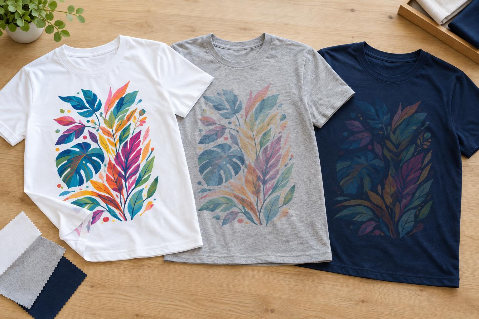
What sublimation does to a T-shirt
Sublimation printing uses heat to move dye from a printed transfer into compatible synthetic fibers. Instead of leaving a noticeable layer of ink on top of the shirt, the color becomes part of the receptive material. This can give the printed area a light feel, especially across a large design. It does not, however, make every T-shirt equally suitable for the process.
A typical workflow uses artwork printed with sublimation ink onto transfer paper, followed by a heat press. The combination of equipment, temperature, pressure and timing matters, but the shirt itself is just as important. A well-prepared transfer cannot make an incompatible fabric hold the dye as intended. When comparing decoration methods, start with the garment you want to wear, not just the image you want to print.
Why polyester content changes the result
Polyester is the usual choice for sublimation T-shirts because its fibers accept the dye during the heat-transfer process. A white or pale shirt with a high polyester content generally gives the design the best chance of looking strong and clear. Fabric weight, knit structure and surface texture can still affect how crisp or even the image appears, so polyester content is a useful starting point rather than a promise of a particular result.
Cotton does not accept standard sublimation dye in the same way. On a cotton-polyester blend, the polyester fibers can take color while the cotton fibers remain comparatively unprinted. The result may look softer, faded or speckled, which can be appealing for a worn-in style but disappointing when the goal is a solid block of color. Two blends with the same stated fiber percentages may also look different because their fibers and surface textures are arranged differently.
You may encounter products or treatments intended to make sublimation possible on cotton or other surfaces. These add a receptive layer or otherwise change the usual fabric-and-dye relationship. Consider their feel and care requirements separately from those of conventional sublimation on polyester; do not assume they will behave like a design dyed directly into polyester fibers.
Why the shirt’s color shows through
Standard sublimation dye is not an opaque coating, and a sublimation printer does not normally print white dye. Any white area in the artwork is therefore the unprinted color of the shirt. On a white T-shirt, that makes it relatively straightforward to plan a design with white highlights. On a cream, gray or pastel shirt, those same highlights take on the fabric’s color.
The fabric also influences printed colors. A pale blue shirt, for example, can change the appearance of a yellow or skin-tone detail because the underlying blue remains visible. Dark shirts present a bigger obstacle: a design transferred directly onto dark polyester will have little contrast, and its pale details will not turn white. If a design needs bright, opaque color on a dark shirt, consider a different decoration method that can place an opaque layer on the fabric.
This does not mean sublimation is limited to plain white shirts. Light-colored shirts can work well when their shade is part of the design. A muted, tonal graphic on a pale garment may be more successful than artwork that depends on exact color matching. Treat the shirt as an active background, not a blank canvas.
Planning artwork for the fabric you have
Before preparing a transfer, check the garment label for fiber content and note its base color. Then identify which parts of your artwork rely on white, very pale tones or precise color contrast. A bold design with clear separation between shapes is often easier to read on a tinted shirt than one built from subtle gradients. Fine details and small lettering deserve particular attention because fabric texture and transfer conditions can make them less distinct.
Screen colors are only a preview. A display emits light, while a printed shirt reflects it, and the fabric contributes its own color and texture. If the final appearance matters, use a small test on the actual garment or a comparable piece of the same fabric before committing to a larger design. View the result in ordinary lighting and check both the color and the legibility of important details.
Placement matters too. Seams, collars, pockets and thick hems can prevent even contact in a heat press. Keeping critical details away from raised areas can reduce the risk of an uneven transfer. If you want a design to extend close to an edge, account for the garment’s construction when choosing its position.
Choosing the method that suits the shirt
Sublimation is worth considering when you want a lightweight printed feel on a suitable light polyester T-shirt. It is less suitable when the shirt must be cotton, the base color is dark, or the design requires opaque white. In those cases, compare methods such as screen printing, direct-to-garment printing or heat-transfer decoration according to the fabric, design and finish you prefer. Each has its own trade-offs in texture, setup and care.
For a sublimated shirt, follow the garment’s care label and avoid unnecessary harsh treatment. Turning it inside out for washing and avoiding excessive heat are sensible ways to care for both the fabric and the decoration. Above all, choose the shirt and the artwork together: fabric content determines how the dye takes, and fabric color determines what the viewer ultimately sees.


