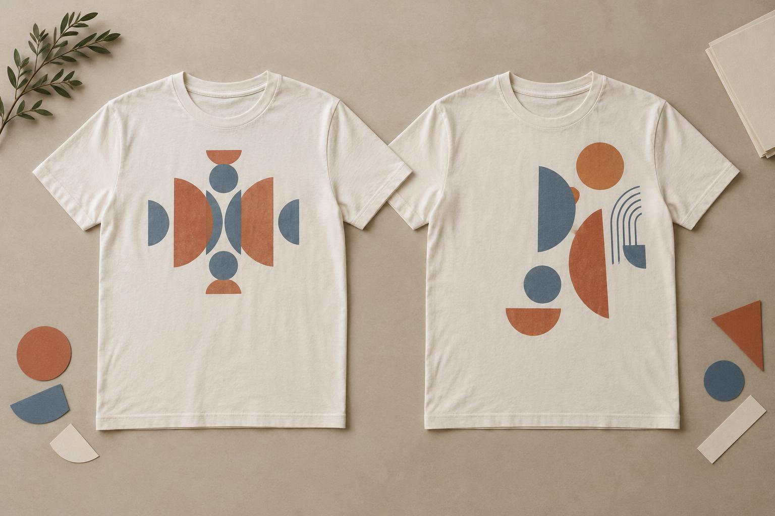
What balance means on a T-shirt
Symmetry means that elements on either side of an axis mirror one another or feel closely matched. On a T-shirt, that axis is often the vertical line down the center of the body. A centered wordmark, circular badge, or evenly spaced illustration can create a clear, orderly impression. It is usually easy to read at a glance because the viewer knows where to look first.
Asymmetry places different elements on either side of that axis. It does not mean scattering artwork at random. A small, dark symbol on one side might be balanced by a larger, lighter shape on the other. The aim is visual balance rather than identical halves. Either approach can work for a quiet design or a bold one; the choice depends on the message, the artwork, and how the shirt will be worn.
When symmetry earns its place
A symmetrical composition suits designs built around a strong central idea. A short phrase above an illustration, a crest, or a single image framed by matching details can feel deliberate without asking the viewer to decode the layout. Centering is also a useful starting point when the artwork needs to be recognizable from a distance. The shirt’s body provides a natural frame, and the graphic can sit within it without competing with seams or sleeves.
Symmetry does not require every letter or shape to be a mirror image. A centered layout may still use varied type sizes or an irregular illustration. Check the overall silhouette: if one side of a drawing is much darker or more detailed, it may appear to lean even when its bounding box is perfectly centered. Adjusting spacing, scale, or nearby empty space can make the design feel more balanced than measuring equal distances alone.
How asymmetry creates movement
An asymmetric layout can guide the eye across the garment. A small chest graphic paired with a larger element lower on the opposite side, for example, creates a visual path. Offset type can suggest energy, informality, or a sense of direction. These choices are especially useful when the concept involves motion, contrast, or a deliberate break from a conventional centered print.
Give the viewer an anchor before adding secondary elements. That anchor might be a large word, a distinct shape, or a high-contrast image. Then use differences in size, color, detail, and spacing to support it. If every element demands equal attention, the arrangement may feel accidental. Leave enough open fabric around the artwork so the offset position looks intentional rather than like a centered design that slipped sideways.
Design for the garment, not just the page
A T-shirt is not a flat rectangular poster. Its neckline, sleeves, side seams, and changing contours affect how a graphic appears. Fabric also shifts when someone moves. An arrangement that looks balanced on a square canvas may feel crowded near an underarm or disappear into a fold when worn. Consider whether the design should read clearly from the front, whether a small detail needs close viewing, and how much blank space surrounds the print.
Fit changes the impression, too. A wide shirt may offer more apparent space around a centered graphic, while a closer fit can make the same artwork feel larger. Off-center designs are particularly sensitive to placement: a modest shift can look purposeful, but moving artwork too close to an edge may make it hard to see. If a design crosses seams or extends around the body, check what the intended decoration method and garment allow before treating a digital mockup as a final placement guide.
A simple way to compare both approaches
Start with the same words, images, and approximate print area in two versions. In the first, align the main elements around the shirt’s centerline. In the second, move the focal point away from center and rebalance the remaining elements through scale or spacing. View both at a size similar to the finished graphic, then shrink them until details are less obvious. Ask which version communicates the idea faster and whether the arrangement still feels intentional.
Finally, place each version on a shirt-shaped mockup rather than judging it only on a blank canvas. Look at it from a distance and imagine the shirt on a moving body. If the centered version feels too static, vary the internal arrangement without abandoning its clear structure. If the asymmetric version feels unsettled, simplify it or strengthen its focal point. Symmetry and asymmetry are tools, not rules: choose the composition that makes the idea readable and gives it the character you want.


