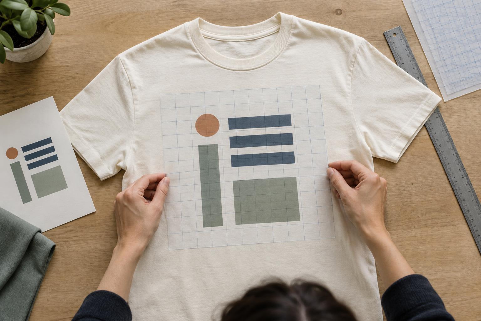
Start with the garment, not just the artwork
A T-shirt design is viewed on a moving, three-dimensional surface. A composition that looks balanced in a rectangular file may feel too low, too wide, or crowded once it sits between the collar, sleeves, and side seams. Before arranging individual elements, sketch the front or back of the shirt and mark the area where the design could sit. Treat that area as a working boundary, not a promise of an exact printed size.
Choose the intended placement early: a centered chest graphic, a small left-chest mark, or a larger back design will each need a different layout. For a centered composition, draw a vertical line through the garment and use it as a reference. For a left-chest design, judge the artwork against the collar and the wearer’s left side rather than centering it within the whole shirt. Leave room around seams and edges so the design does not appear squeezed into the available space.
Build a simple grid around the message
A grid is a set of guides that helps related elements line up. It does not have to be complex. A centerline and a few horizontal guides may be enough for a graphic with one illustration, a headline, and a short line of supporting text. A design with several badges or blocks of information may benefit from two or three columns. Start with the simplest grid that gives each element a clear place.
Decide what a viewer should notice first. Make that element prominent through size, position, contrast, or surrounding space, then use the grid to place secondary details. For example, a large illustrated symbol can occupy the center while a short phrase aligns beneath it. If the phrase is the main attraction, give the lettering the strongest position and let small decorative shapes support it. The guides should help establish a reading order, not force every element to be equally important.
Use alignment to create relationships
Elements that share an edge or centerline tend to look connected. Center alignment can suit a compact emblem or a design built around a single phrase. Left alignment can make several lines of text easier to scan, especially when they have different lengths. Mixing alignments can work, but give the change a purpose. A centered headline above a left-aligned list, for instance, needs enough separation to make the shift feel deliberate.
Pay attention to the spaces between elements as well as the elements themselves. If a subtitle belongs to a headline, place them closer together than either is to an unrelated illustration. Keep repeated gaps reasonably consistent, and check whether the margins around a grouped design feel balanced. These decisions often do more to organize a shirt graphic than adding extra lines, boxes, or ornaments.
Mathematical centering is not always visual centering. A tall letter, an uneven illustration, or a shape with a heavy dark area on one side may look off-balance even when its bounding box is centered. Use guides to establish the structure, then make small optical adjustments while viewing the whole design.
Let the grid support the design’s character
A grid does not require every T-shirt to look formal. A playful design might use tilted lettering or an illustration that crosses a column boundary. The underlying structure can still hold it together: align the main text to one anchor, keep a consistent gap between related parts, or balance a large shape with a smaller detail elsewhere. Breaking one guide tends to feel more intentional when other guides remain visible in the composition.
Avoid filling every available space. Blank areas can give a bold graphic room to stand out and help small details remain distinct. If a layout feels busy, try removing an element before shrinking everything to fit. If it feels disconnected, look for a shared edge, centerline, or repeated spacing that could bring the pieces together. A good grid is a tool for editing as much as for placing artwork.
Check the layout at wearable size
Review the design on a shirt mockup or a simple garment outline, then check it at an approximate real-world size. Text that is comfortable to read while zoomed in may become hard to make out on a shirt. Fine details can also compete with fabric texture or the chosen decoration method. The practical limits vary, so confirm size and artwork requirements with the printer or decorator before finalizing the file.
Look at the design from nearby and from several steps away. Ask whether the main idea reads first, whether the artwork sits naturally on the garment, and whether any element feels stranded or crowded. Try the layout on each shirt color you plan to use, since contrast can change the apparent balance. Once those checks are done, remove the guides and view the design without them. If the composition still feels clear and cohesive, the grid has done its job.


