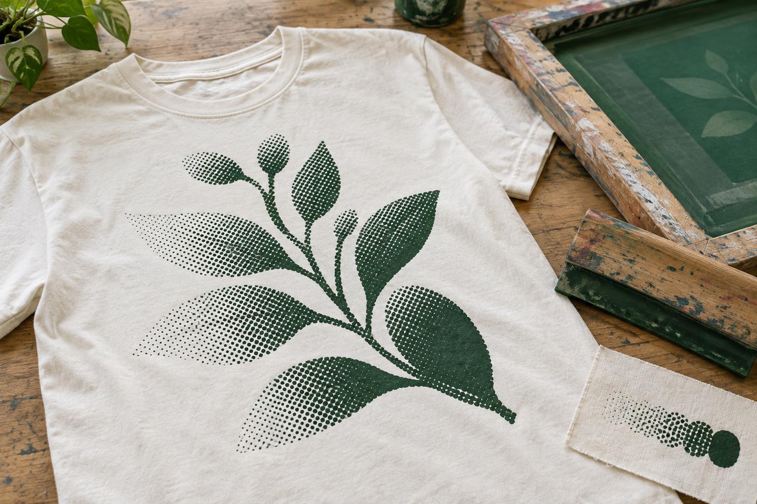
How halftones create the appearance of shading
A screen-printing stencil usually treats each part of a design as either open, where ink can pass through, or closed, where it cannot. A halftone creates the appearance of a gradual shade by breaking it into a pattern of small printed marks. Larger or more closely grouped dots appear darker; smaller or more widely spaced dots allow more of the shirt color to show through. From a normal viewing distance, the eye blends the pattern into a tone.
This makes halftones useful for soft shadows, faded edges, photographic effects, and illustrations that need more depth than a solid shape provides. A single ink color can suggest several shades, although the result will not look exactly like a smooth gradient on a backlit screen. The visible dot texture can also be an appealing part of a T-shirt’s design.
Start with artwork that suits the shirt
Think about the shirt color as part of the image. On a light shirt, dark ink dots can shade into the exposed fabric. On a dark shirt, a light ink can build highlights against the fabric instead. If the design depends on subtle midtones, the choice of ink and garment may change how clearly those tones read. A colored or textured fabric can also affect the perceived shade in areas between the dots.
Before converting an image to halftones, simplify details that would be hard to recognize at the intended print size. A small portrait, for example, may need stronger contrast around the eyes and mouth than a large print does. Remove visual noise that does not contribute to the subject, and check that the image still reads when viewed at approximately the size it will appear on the shirt. A strong silhouette and clear focal point often matter more than preserving every shade in the original artwork.
Choose a dot pattern with printing in mind
Halftones can be arranged in regular rows or in less orderly patterns. In a regular pattern, dot frequency describes how many rows of dots fit into a given distance. Finer patterns can show delicate transitions, but their smallest dots and gaps may be difficult to hold on a screen or reproduce on fabric. Coarser patterns tend to make the texture more visible, while offering more room for small marks to remain distinct.
Dot shape and angle also influence the appearance. Round dots are a common starting point, but an elongated dot or a deliberately rotated pattern may better suit a particular illustration. When several patterned ink layers overlap, poorly chosen angles can produce distracting larger-scale patterns, sometimes called moiré. If a design uses multiple colors or an underbase, discuss the separations with the printer rather than assuming that settings suited to a one-color print will transfer unchanged.
Allow for ink spread and lost detail
Printed dots may appear larger than they did in the artwork because ink spreads or sits differently on the fabric. This effect is often called dot gain. Very small light-area dots may disappear, while tiny gaps in dark areas may fill in. The outcome depends on factors such as the ink, garment surface, screen preparation, and print setup, so there is no single dot size or tonal range that suits every job.
A practical way to prepare is to avoid making the image depend on its faintest highlights or deepest shadow details. Open up crowded dark regions, give important lines enough space, and compare the artwork at full print size rather than relying on a zoomed-in preview. On a dark garment, a white underbase can help colored ink stand out, but it adds another printed layer whose alignment and texture need consideration. For some designs, letting the shirt color show through is simpler and visually effective.
Test the effect before committing to a design
Ask for the printer’s artwork guidance early, particularly if the design contains a photograph, several ink colors, or fine shading. Share the intended print dimensions and garment type. A printer may suggest adjusting contrast, changing the dot pattern, simplifying separations, or using a different decoration method for the effect you want. These are design choices, not just file-export settings.
When possible, review a sample on the intended fabric. Look at it from a normal viewing distance as well as close up: does the subject read clearly, are the transitions pleasing, and do important highlights and shadows survive? A halftone does not have to hide its dots to succeed. Used deliberately, its texture can turn a printing constraint into a distinctive part of the artwork.


