Give the main idea room to stand out
Negative space is the area around and between the visible parts of a design. On a T-shirt, that might be bare fabric around an illustration, the gap between a slogan and an icon, or an opening cut into a solid shape. It is not wasted room. It helps the viewer identify what matters before noticing smaller details.
Start by choosing one focal point: a word, symbol, character or simple scene. Then look at the nearest elements and ask whether they support that focal point or compete with it. A cluster of stars, borders and tiny captions may be appealing on a large screen but can make the central image harder to find on a shirt. Removing one element or widening a gap can do more for clarity than enlarging everything.
Create a clear path for the eye
Spacing can establish an order of attention. If a design has a headline, image and short caption, give each part its own breathing room. Keep related items close enough to read as a group, but leave a more noticeable gap between groups. This makes the layout easier to scan without requiring extra arrows, boxes or decorative dividers.
Pay particular attention to edges. A graphic that nearly touches a frame, a line of text or another shape may look accidentally cramped. Either let the elements meet deliberately or separate them clearly. The same principle applies inside an illustration: open areas between a hand and a face, for example, can help those forms remain distinct. Try viewing the artwork as a small silhouette to see whether its major parts still make sense.
Use empty areas as part of the graphic
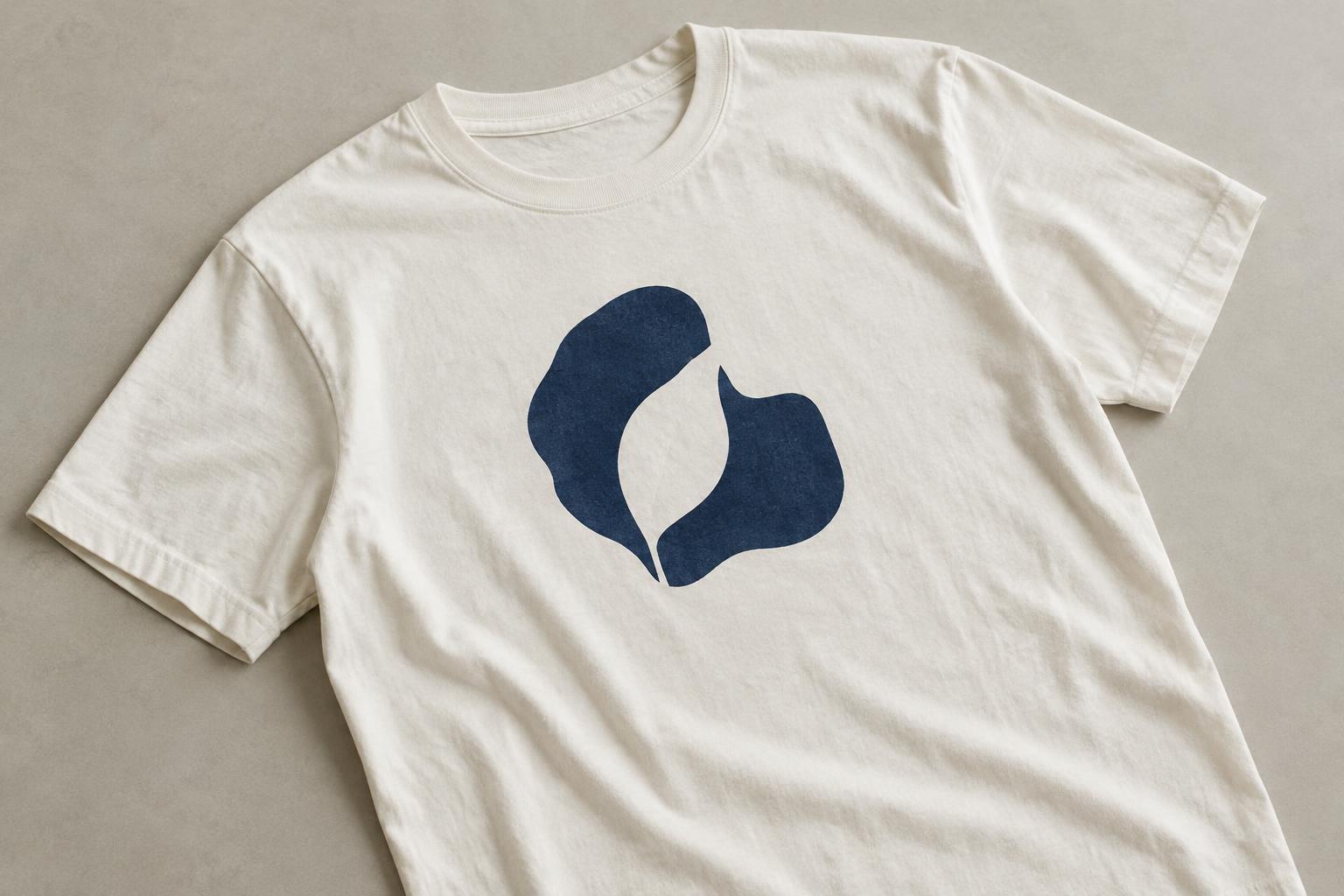
Negative space can do more than separate objects. A gap inside a bold shape can suggest a second image, such as a leaf formed by the space between two curved forms. This approach works best when the primary shape reads immediately and the hidden image is a bonus. If recognizing the whole design depends on spotting a subtle gap, simplify the surrounding detail or make that gap more generous.
Decide whether an apparently empty area should show the shirt fabric or be printed in a color close to it. Those choices can look different, especially on textured or heathered fabric. Fabric showing through may make a design feel lighter and more integrated with the garment; a printed fill may produce a more uniform shape. Neither is automatically better, so consider the garment color and the effect you want before preparing the artwork.
Protect the space around lettering
Words need room both around them and within their letterforms. Tight letter spacing, narrow openings inside letters and a slogan placed too close to an illustration can all make reading harder. Choose a type style that suits the message, then check it at approximately the size it will appear on the shirt. If a phrase only works when zoomed in, consider fewer words, larger lettering or a simpler typeface.
Also check the contrast between the lettering and the garment. Negative space cannot rescue text that blends into its background. A compact block of type may work when it is short and clearly separated from other elements; a longer message often benefits from more open line spacing and fewer decorative flourishes. Leave a comfortable margin around the entire text block rather than filling every available corner.
Test the design on a garment, not just a screen
A flat digital canvas does not show how a shirt curves, folds or moves. Place the design at its intended size on a garment mockup or a simple paper template, then step back and look at it from a normal conversational distance. Notice what you see first, whether the text is easy to follow and whether small gaps disappear. Repeat the check on each garment color you plan to use.
Printing and decoration methods may handle fine lines and narrow unprinted gaps differently, so treat tiny spaces with caution. If you are preparing a file for production, ask the printer for its artwork guidance rather than assuming a detail will reproduce as it appears on screen. A final edit can be surprisingly simple: widen an opening, move two elements apart or remove a border. The goal is not to make the shirt empty, but to give its best idea enough space to be seen.


