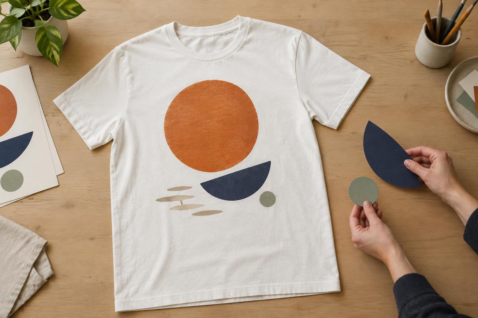
Choose the first thing the design should say
Visual hierarchy is the order in which someone notices and understands the parts of a design. On a T-shirt, that order matters because the wearer may be walking, standing across a room or partly covered by a jacket. A viewer might first see a large shape or a few words, then get close enough to notice smaller text. A strong design gives each of those moments a purpose.
Before arranging anything, write down the one idea that must come across first. It might be a name, an illustration, a short phrase or a recognizable symbol. Treat supporting information, such as a date or a longer caption, as secondary. If every element is equally prominent, the viewer has to work out where to begin. Keeping one clear focal point makes the design easier to read without requiring it to be simple or plain.
Use scale to establish an order
Size is one of the clearest ways to signal importance. A large central illustration can lead the eye, with a smaller line of text explaining it. Alternatively, a bold phrase can be the main event while a small icon adds character. Start with the dominant element and add supporting parts only after its position feels settled. This helps prevent a collection of individually appealing pieces from competing for attention.
Think about how much of the garment a design occupies, not just how large it looks on a screen. A graphic that fills a digital canvas may feel crowded when placed on a chest. Small lettering may look crisp while zoomed in but become hard to make out at a comfortable viewing distance. If a detail is essential to the message, give it enough size and space to survive a quick glance. If it is a reward for closer inspection, it can stay quieter.
Guide the eye with contrast and spacing
Contrast helps separate the focal point from its surroundings. That can mean a light graphic on a dark shirt, a bold typeface beside a delicate drawing, or one saturated color in an otherwise restrained palette. The shirt color is part of the composition: a color that stands out on a white mockup may blend into a garment of a similar tone. Look at the design against the actual shirt color you intend to use.
Empty space matters just as much as visible marks. Space around a headline or illustration gives it room to lead; tight clusters of text and ornament can make everything feel equally busy. Try removing a border, shrinking a decorative element or increasing the gap between primary and secondary information. These small changes can make the intended reading order more obvious without changing the idea itself.
Place elements for a garment, not a page
Placement changes what a viewer sees first. A centered chest graphic makes a direct statement, while a small left-chest mark may read as a subtle identifier. A back print can carry a larger message, but it will not be visible from the front. Decide whether the design needs to communicate at first sight or can reveal itself as the wearer turns. If you use both front and back, give each side a clear job rather than repeating every element.
The garment also moves and folds. A composition that depends on perfectly straight lines or tightly aligned details may look different when worn than it does laid flat. Consider likely interruptions from seams, pockets, layers and the natural shape of the torso. Exact printable areas and how fine details reproduce depend on the garment and decoration method, so leave room to adapt the layout before production.
Test the reading order before finishing
A useful check is to view your design at several sizes. Look at it as a small thumbnail, then at a size that suggests a person standing a few steps away. Ask what you notice first, what you understand next and whether anything important disappears. Briefly looking away and back can also reveal which element wins the first glance. If it is not the element you intended, adjust its scale, contrast, position or surrounding space.
Finally, check the design on a mockup in the intended shirt color and approximate placement. Compare a few variations rather than changing everything at once: for example, test two headline sizes or move one illustration slightly higher. Visual hierarchy is not about making every design loud. It is about giving the viewer a clear way in, whether the finished shirt is bold, understated, playful or detailed.


