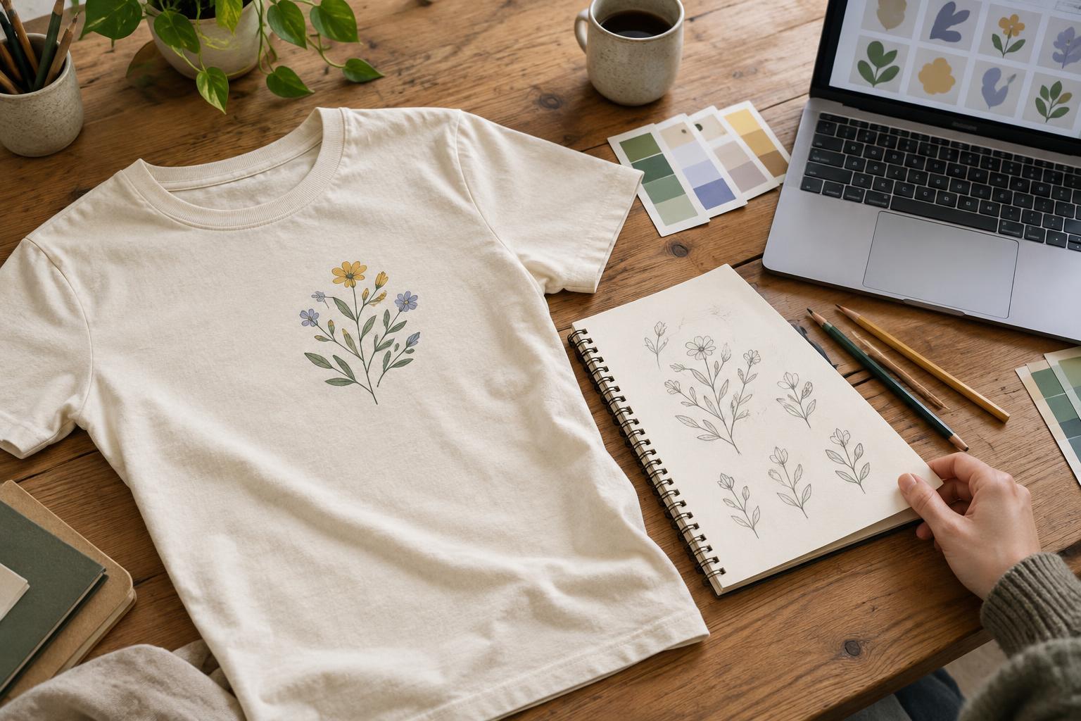
Start with how the shirt will be seen
Graphic placement is not just a question of where there is room. It changes how a design is noticed and how the shirt feels to wear. Before choosing a location, picture the shirt in its usual setting. Will someone see it mainly face-to-face, from behind in a crowd, or beneath an open jacket? Will the wearer want the design to be the focus of an outfit or a quieter detail?
A useful starting point is to name one primary viewing moment. A front graphic works when the design should be visible during conversation. A back graphic gives a larger idea space when people are likely to see the wearer walking away or standing ahead of them. A small chest or sleeve mark can add identity without making the entire shirt feel like a display surface. You can combine locations, but each one should have a purpose.
Choose a front placement that suits the design
A central front placement gives an illustration or short phrase a clear focal point. It usually suits artwork meant to be read as one image. The design still needs breathing room: a graphic pushed too high can crowd the collar, while one placed too low may disappear when the shirt is tucked in or bunches at the waist. Check the placement on a person or a realistic garment mockup rather than judging it only on a flat rectangle.
A small left- or right-chest design has a different job. It can carry a symbol, brief name or compact mark without dominating the shirt. Keep details simple enough to remain clear at the intended size, and consider how the design relates to the collar, shoulder seam and center line. A chest mark may look balanced on one garment size but drift visually on another, so review more than one size if the same design will be used across a range.
Give back and sleeve graphics a reason to be there
The back offers space for a secondary message, a larger illustration or a more detailed composition. It can also pair well with a small front mark: the front introduces the idea, and the back expands it. Avoid treating the back as spare space that must be filled. If the front already contains everything the design needs, an empty back may make the shirt more versatile.
Sleeves work best for short, self-contained elements such as a small icon or a few characters. Their curved shape and movement make them less suitable for information that needs sustained reading. Also think about whether the mark should face forward or sit toward the outside of the arm. Sleeves vary in length and width between fits, so a design that looks comfortably spaced on one style may feel cramped on another.
Account for fit, movement and decoration
A shirt is a moving surface. Fabric stretches across the chest, folds near the waist and shifts when the wearer raises an arm. Put a paper printout of the artwork against a shirt worn in the intended size, then check it while standing, sitting and moving. This quick test can reveal a phrase that breaks across folds or an image that feels wider than expected. Ask for a second opinion, but let the intended wearer's comfort guide the decision.
Decoration method can affect placement choices, too. Some methods and garments may limit the usable area near seams, pockets or other raised features. Large decorated areas can also feel different from small ones, depending on the method and materials. Before finalizing a layout, confirm the available print or embroidery area and any placement requirements with the provider who will make the shirt. Treat a digital mockup as a planning aid, not a guarantee of the finished position.
Make a placement plan before approving the design
Record placement in a way another person can repeat. Identify the garment style and size used for reference, state whether the artwork is centered on the shirt or aligned to a seam or panel, and note its intended size and position relative to visible features such as the collar. Specify which side of the shirt and which sleeve you mean. Phrases like “a little below the neck” leave too much room for interpretation.
Finally, view the whole shirt rather than each graphic in isolation. Check whether front and back elements feel related, whether a sleeve mark adds something useful, and whether the design remains appealing when partially covered by a jacket or tucked into trousers. If any placement feels uncertain, test one alternative before committing. Moving the same artwork can change the character of a shirt without changing the artwork itself.