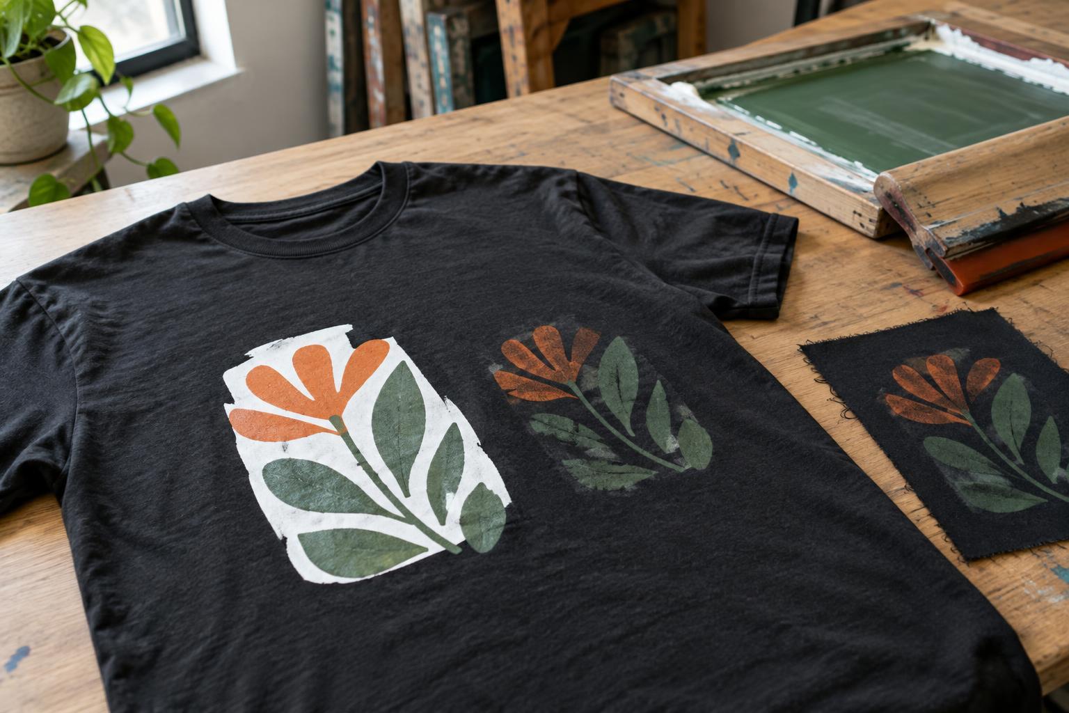
What is an underbase?
An underbase is a layer printed beneath the visible parts of a design, usually in white ink. On a dark T-shirt, it creates a lighter surface for the colors above it. Without that layer, some inks may let the fabric color show through, making a bright yellow look muted or a pale blue appear much darker than intended.
Think of the difference between drawing with a colored marker on white paper and on black paper. The artwork has not changed, but its background changes what you see. An underbase helps separate the artwork from that background. It does not automatically make a print look identical to the same design on a white shirt; ink, fabric and printing method still affect the result.
When an underbase helps—and when it may not
Designs with bright colors, light lettering or small areas of strong contrast often benefit from an underbase on dark fabric. It can be especially useful when the intended color needs to remain recognizable rather than blend visually with the shirt. A design made only in opaque white ink, however, may not need a separate white layer beneath it. A deliberately subdued print may also work without one.
The choice is partly aesthetic. Printing color directly onto dark fabric can give artwork a softer, more integrated appearance, though some colors may become hard to see. Adding a base can make the same artwork look bolder and more defined. Before deciding, identify which parts of the design must be legible and which could look good with a darker, vintage-style effect.
Not every decoration method uses an underbase in the same way. Screen printers may print a white layer before the color layers. Direct-to-garment printing on dark shirts commonly relies on white ink beneath colored ink. Some transfers combine their own opaque layers with the design. Methods and materials vary, so ask how the chosen process handles light colors on dark fabric rather than assuming every print is built alike.
How an underbase affects artwork and print feel
An underbase needs to sit under the intended artwork, not extend visibly beyond its edges. If the white layer and colored layer do not align closely, a thin white outline can appear where none was intended. Printers may adjust the base slightly inward to reduce this risk. Fine lines, tiny lettering and narrow gaps can be harder to reproduce cleanly when several layers must line up.
A larger or heavier ink area can also feel more noticeable on the shirt. That does not mean every underbased print will feel stiff: the result depends on the ink, garment, artwork coverage and printing process. Still, a large solid rectangle is likely to feel different from a design made of smaller, separated shapes. If a softer feel matters, consider reducing unnecessary background shapes or using the shirt color as part of the design.
When preparing artwork, be clear about which areas should print and which should remain open fabric. A transparent background in a design file should not be confused with a colored shape that needs to be printed. It also helps to view the artwork against an approximation of the actual shirt color. A design that looks clear on a white screen preview may need changes to its contrast or line thickness for a dark garment.
Questions to ask before approving a dark-shirt print
Start with the result you want: bold, close-to-artwork color, or a softer print that interacts with the fabric. Then ask the printer whether the chosen method uses an underbase, which areas will receive it, and whether any fine details need simplifying. If the design includes gradients, semi-transparent effects or distressed textures, ask how those elements will translate to the selected process. Their appearance can change when white ink is placed beneath them.
Also consider the garment itself. Fabric texture and color can influence how a print appears, while different shirt styles can change where the artwork sits when worn. For an important order, a physical sample may reveal color, feel and placement more clearly than a digital preview. If a sample is not practical, ask for a clear description of the likely trade-offs rather than treating a screen image as a guarantee.
An underbase is a useful tool, not a rule for every dark T-shirt. Understanding what it does makes it easier to choose between a vivid print and one that intentionally lets the garment show through—and to prepare artwork that suits that choice.


